Improving Elementor accessibility for people with diverse abilities is an important first step in elevating the website experience for the audience.
Being a popular WordPress page builder, Elementor offers immense design flexibility and features to take your website to the next level. However, optimizing its accessibility features is pivotal for reaching a broader audience and adhering to Elementor accessibility guidelines.
And not just that, building accessible websites is also essential to meeting international regulatory standards and making your website ADA-compliant.
But how can you achieve that? In this article, we’ll discuss the importance of an accessible Elementor website and explore the steps to improve Elementor web accessibility.
What is Elementor Accessibility?
Simply put, an accessible Elementor website is one that is readily accessible and comprehensible by all visitors, including those with disabilities or impairments. It includes the employment of any tools or technologies used to make the Internet more accessible.
Elementor and web accessibility also involve following specific design principles to ensure a seamless website experience for users who experience limitations.
For instance, people using different screen sizes, slow internet, people with disabilities such as visual impairment, or someone with situational disability like bright sunlight might have difficulty interacting with your website.
As a result, having built-in enhancements in your website is crucial to improve accessibility and offer a seamless website experience to everyone.
Getting started with Elementor for your WordPress website? Check out the beginner’s guide and learn How to use Elementor in WordPress effectively.
What is ADA Compliance?
ADA compliance refers to the Americans with Disabilities Act Standards for Accessible Design that mandates the inclusion of every individual, especially those with disabilities, into all areas of public life.
It also states that all electronic and information technology – such as websites – must be accessible to people with disabilities or limitations.
The purpose of this law is to offer equal opportunities and the same rights to individuals with disabilities as others. Websites aren’t overtly included in the ADA guidelines, but they are considered an area of public life.
Since there are no clear guidelines for ADA compliance for websites, website owners can adhere to Web Content Accessibility Guidelines (WCAG) 2.1.
Important Factors of Web Accessibility to Consider
There are four main factors of web accessibility that you must consider when building your Elementor website-
1. The Content Must Be Visible
Users study and absorb every element of your website – from the content and text size to font, page layout, and the colors used by employing their sense of sight.
However, for users with limitations, the website must use alternative ways to engage them.
In this regard, it is important to ensure your website is designed with accessibility in mind. Consider adding captions or subtitles to the various media elements you have on your website.
Using assistive technology like screen readers (text-to-speech) features with your visuals can help convert the text to audio and create an excellent website experience.
2. The Content Should Be Easy to Understand
Another aspect of visual content is that it should be easy to read, comprehend, and navigate.
This involves using appropriate font size, style, and color contrast for better readability, the use of simple language to ensure understanding, and a clear and minimal website design for easy navigation.
Also, consider adding different media elements to your website like images and videos to make it easy to understand the content and highly engaging.
3. The User-Interface Should Be Functional
Your website users will be accessing your website from different devices, screen sizes, as well as hardware components like a mouse or keyboard.
As a result, you’ll want your website to cater to as many users as possible, so that they can navigate and interact with your website easily, regardless of the device they’re using.
For instance, giving them enough time to read confirmation messages on the screen before the page reloads. Or supporting easy navigation with site search or skip navigation links.
This helps create a fully functional and smooth website.
4. Your Website or Web App Must Be Reliable
Finally, your website should also cater to different operating systems and browsers to accommodate a large number of users.
A good way to achieve this is by using the right tools and technology in the website development stage.
Besides, to make Elementor accessible to a maximum number of users, consider supporting even the outdated browser versions (up to a certain limit) and validating your site against certain technical standards such as CSS equivalent to ensure the proper functioning of the website.
How to Improve Elementor Accessibility?
With Elementor, you get access to accessibility improvement features built-in that will automatically help improve your website.
When enabled, it will enhance keyboard navigation, remove empty <a> tags, add options for chosen tab states, and more to your website.
To enable this feature, go to the WordPress dashboard and Elementor > Settings > Experiments.
Here, navigate to Accessibility Improvement, and select Active from the drop-down menu. Click on Save Changes.
In addition to this, there are various other ways to make your Elementor website accessible.
Here is a Elementor web accessibility checklist to design a great website:
1. Elementor Font Family and Size
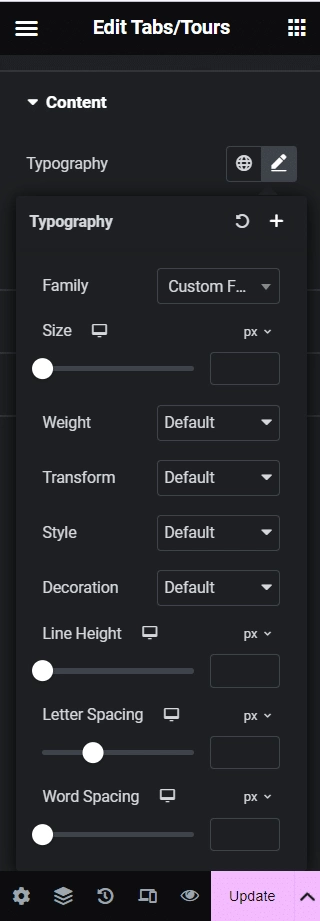
To begin with, choose the right Elementor font family and size to cater to a wider audience and different screen sizes.
In Elementor, you have access to tons of font types with your website theme where you can pre-configure the size and even change the font size for individual pages across the website.
In addition, the font type you choose should have good legibility, thickness, and a good height, and width to improve the accessibility of content.
Consider using the default font size of 16px used by most browsers and set up REM settings to allow the user to scale the font proportionately on their devices.
Want to choose a unique font for your site? Here are the Best Elementor Fonts you should consider.
2. Ensure Proper Color Contrast
The color contrast is the perceived difference between two colors, typically between the background and the foreground. When it comes to making your website readable and accessible, color contrast is equally important as font type and size.
To achieve the perfect color contrast per the WCAG guidelines, pick the right color combination, make sure that the opacity is set to 100%, and use the Backdrop Overlay widget in Elementor to darken the background and make your text pop on screen.
3. Include Textual Labels in Forms
If you have added contact or sign-up forms on your website, make sure that the form fields and other elements have textual labels to ensure a seamless website experience for all individuals.
Looking to experiment with more font styles for your website? Check out How to Add Custom Fonts to Elementor to enhance your website aesthetic and content.
4. Add Alt Attributes to Images
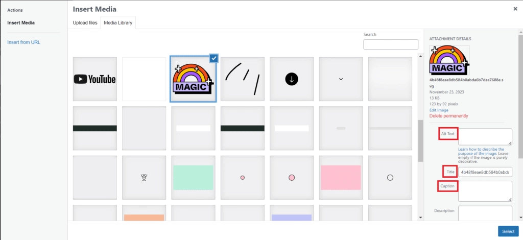
Next, images and other media elements should be accompanied by captions and alt attributes (called alt tags) to offer an alternative way for visually impaired users to access your content.
Such users might not be able to view the visuals on your website, but accurate and descriptive alternate texts can be accessed through screen readers.
Not to mention, adding alt tags also helps improve your site’s SEO in Image results.

To add alt texts to your visual elements, click on the image in the style tab and add the alt text, along with the title, and caption in the media window.
5. Make Your Design Responsive
In this digital age, creating a highly interactive and responsive website isn’t simply a choice, it’s a necessity. Given how your audience will be visiting your website through different devices, it’s important to create a responsive website design.
You can start by gathering data about the most popular screen sizes among your website visitors and create different layouts to align with each. Further, using smaller texts, multiple columns, and adequate line height on larger screen sizes can help improve readability.
On the other hand, for smaller displays, hidden, expandable navigation options, larger text, and a single column for content can be a better approach.
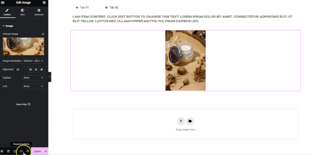
Elementor lets you see how your website pages and design will look on different screen sizes, with its responsive mode feature. On the Elementor menu, all you need to do is click on the responsive mode icon at the bottom to view your webpage.
Want to create a simple and minimal website layout? Learn How to Create One Page Navigation in Elementor for Single Page Website.
6. Add ARIA Labels
ARIA labels are another excellent way to improve Elementor accessibility. These labels are used to provide more information about an element and what it does.
For instance, you can add ARIA labels to highlight a button or a checkbox or show whether an element is enabled or disabled.
This allows visually impaired individuals to gain context about the various elements on the website and makes the site experience more inclusive.
7. Contact Forms
Using REM sizes to scale fonts is a great way to enhance the accessibility of your contact forms as well.
REM unit determines the font size of an element to the size of the root element. Just like the content on your website, utilizing REMs for contact forms allows the font to remain constant and readable across different screen sizes and makes these forms accessible.
Additionally, considering many differently-abled website visitors will use a keyboard to navigate through the website, it is important to allow easy navigation between form fields using the Tab key. If you’re using Elementor’s Form Widget, it handles this sizing function by default.
Useful Tool: PX to REM Converter Online [FREE]
8. Support Keyboard Navigation
To ensure Elementor ADA compliance, you must also support keyboard navigation on your site.
This is because individuals with motor or visual disabilities, who are unable to use a mouse, will depend on screen readers and keyboards to navigate your website.
This is where supporting keyboard navigation and keyboard shortcuts on your website and app will not only accommodate disabled users but also offer others a faster way to interact with the website.
9. Use HTML5 Semantic Elements
HTML5 offers useful semantic elements like <header>, <nav>, <footer>, <article>, <section>, and so on that help give your content more context and meaning.
For instance, if you use the <nav> element to create your navigation section, the screen reader will inform the visitor that the particular text is a part of the navigation section.
Using these semantic elements allows you to create a seamless and convenient website experience for the users.
Make your website stand out with simple and interactive headers. Learn How to Use Elementor Header Templates for your website.
Wrapping Up
Your website is one of the best and easiest for your audience to reach you. So, creating a website that is interactive, engaging, and highly accessible is important to cater to a wider audience.
Start by considering the accessibility factors laid down by the WCAG guidelines and follow the steps mentioned above to improve your website and make it more inclusive.
If you’re using Elementor page builder for your website, you already have access to tons of features and customizations to make your website accessible.
But if you’re interested in doing more for your website, check out The Plus Addons for Elementor, an all-in-one Elementor plugin to enhance your website functionality and accessibility.
