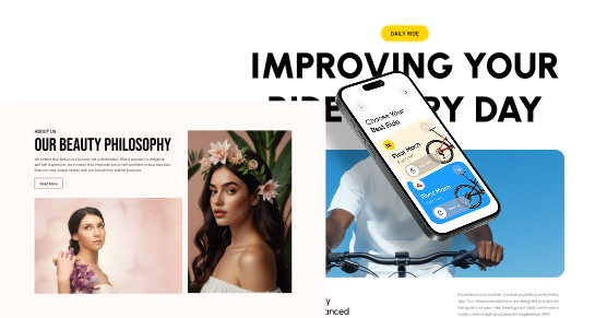
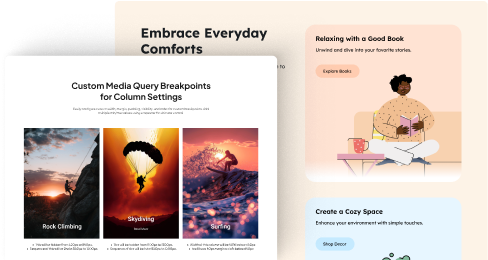
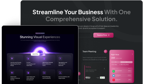
Are you struggling to create a landing page that truly converts? You are not alone, many businesses find it tough to understand their audience, create a clear value proposition, and design an effective page.
In such cases, referring to top landing page examples can help you overcome the blocker and create effective and attractive landing pages that convert.
So in this article, we’ll look at some of the best landing page designs that you can take as inspiration and also you will learn some key metrics to improve your landing page performance.
So without further ado let’s get started!
What is a Landing Page?
A landing page is a single web page that is created specifically for a marketing or advertising campaign and the main goal of this page is to convert visitors into leads or customers.
Unlike regular website pages, which might offer a variety of information and links, a landing page is focused on a single purpose.
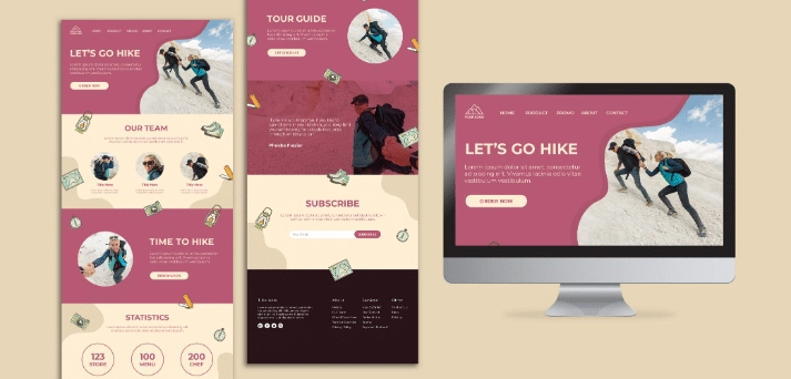
Because they are focused and free from distractions, landing pages typically have higher conversion rates compared to general website pages.
An effective landing page should have a clear headline that communicates the value proposition of the offer, a supporting subheadline that provides more detail, and a persuasive CTA that stands out from the rest of the page.
Key Metrics to Track Landing Page Performance
When it comes to landing page optimization, it’s important to track the right metrics. By doing so, you can identify areas for improvement and optimize your landing page for better results.
Here are eight key metrics to focus on:
- Conversion Rate: Optimize your call-to-action (CTA) placement, design, and messaging to encourage more conversions. Test different variations to see what resonates best with your audience.
- Bounce Rate: Make sure your landing page loads quickly, has a clear value proposition, and meets visitor expectations. Simplify navigation and remove distractions to keep visitors engaged.
- Average Session Duration: Create engaging and relevant content that engages visitors and encourages them to explore further. Use multimedia elements like videos or interactive elements to increase engagement.
- Click-Through Rate (CTR): Write compelling headlines and CTAs that communicate the benefits of taking action. Use convincing language and visual cues to draw attention to your primary CTA.
- Page Load Time: Optimize images and other media files, minimize server response time, and use browser caching to improve page speed. Use tools like Google PageSpeed Insights to identify and address performance issues.
- Mobile Responsiveness: Design your landing page with a responsive layout that looks perfect on different screen sizes. Prioritize mobile-friendly elements like large buttons and easy navigation to improve the user experience.
- Exit Rate: Analyze user behavior to identify common exit points on your landing page. Address any usability issues, clarify messaging, and provide additional incentives to encourage visitors to stay longer or take action.
- Return on Investment: Track the performance of your landing page against key business goals, such as lead generation or sales. Calculate ROI by comparing the revenue generated from conversions to the cost of driving traffic to the landing page.
Best Landing Page Examples
Here are some top landing page examples you can use for your next ad campaign:
1. PlanPro
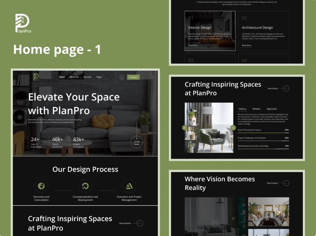
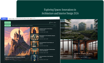
PlanPro is a landing page example mainly designed for architecture and interior design firms. As you click on the homepage, there is a visually attractive slider that showcases the firm’s best work.
Also, there are other sections like highlighting services, team members, and client testimonials. The best part is as you scroll down the page there are multiple attractive animations used for different sections.
This landing page sample is highly customizable with the help of Elementor page builder. You can modify the look and feel of this design to match it with your website’s colors.
What makes this landing page unique?
• Modern and Attractive Design: This landing page design is highly captivating with a focus on architecture and interior design aesthetics.
• Portfolio Section: Showcase your past projects and designs beautifully with the portfolio section, allowing potential clients to explore your work in detail.
• Services Section: You can highlight the range of services you offer, ensuring visitors understand the breadth of your expertise.
2. Brewverse
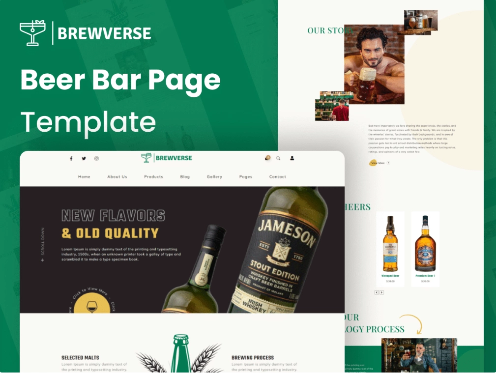
This stunning and creative landing page design offers a modern and sleek design that showcases the essence of a trendy bar and restaurant.
The home page of the BrewVerse is nicely designed to show the unique atmosphere of the bar or restaurant.
Also, the hero section at the beginning of the home page attracts the user’s attention with its high-quality images and persuasive headlines.
This landing page also offers different sections where businesses can promote upcoming events, live performances, or special promotions. You can customize this template using Elementor page builder according to your liking which suits brand identity.
What makes this landing page unique?
- Menu management: With the help of a built-in management system, users can easily update their food and drink menu.
- Online reservation system: with the integration of a popular reservation system, you can add a custom reservation form that allows customers to book tables directly from the website.
- Contact and location information: There is a dedicated location to showcase the opening hours, and a map with the bar’s location so that customers can easily reach your location.
3. SippinSpot
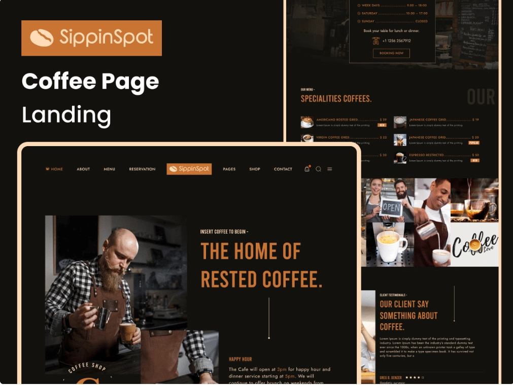
This landing page example is mainly created for coffee cafes and related businesses. The page design is very attractive and easy to navigate.
The homepage is very visually appealing and has a welcoming atmosphere. There are a lot of different sections for displaying the cafe’s menus which can be easily customized and updated.
This landing page is very responsive and looks great on any device whether it’s a desktop computer, tablet, or smartphone.
The best part is it is easily integrated with Elementor so you can edit and customize the page using the Elementor page builder.
What makes this landing page unique?
- Responsive design: This landing page design is highly responsive which means that it allows your customers to reserve a table using any device like a phone, Tablet, Computer, etc.
- CTA Buttons: The color combination and the popup animation used in the buttons make it more clickable.
- Blogging capabilities: Many coffee cafes maintain blogs to share news, new recipes, and other relevant content with their customers.
4. Momentum
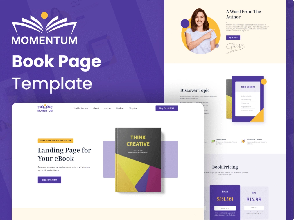
Momentum’s landing page design is known for its simple and minimalist design. This landing page design is created and suitable for various industries.
The homepage of this prebuilt landing page displays the attractive hero section with an image or video background which attracts visitors right from the start.
Also, there are attractive call-to-action buttons that encourage users to explore further. As you scroll down on the page, different sections are available that showcase different key features or services.
The best part is it is built with Elementor, so by leveraging the power of drag-and-drop Elementor builder you can customize this prebuilt template easily without writing a single line of code.
What makes this landing page unique?
- Translation Ready: This design is translation ready which means your visitors can translate the content of the website into their native language.
- Portfolio Showcase: There is a dedicated section for display work and products with customizable layouts.
- One-Click Demo Import: With one-click demo import users can easily import the whole template design with just one click that allows users to quickly set up the landing page.
Read Further: 10 Best Meet The Team Page Examples & Trends [With Templates]
5. Skyframe
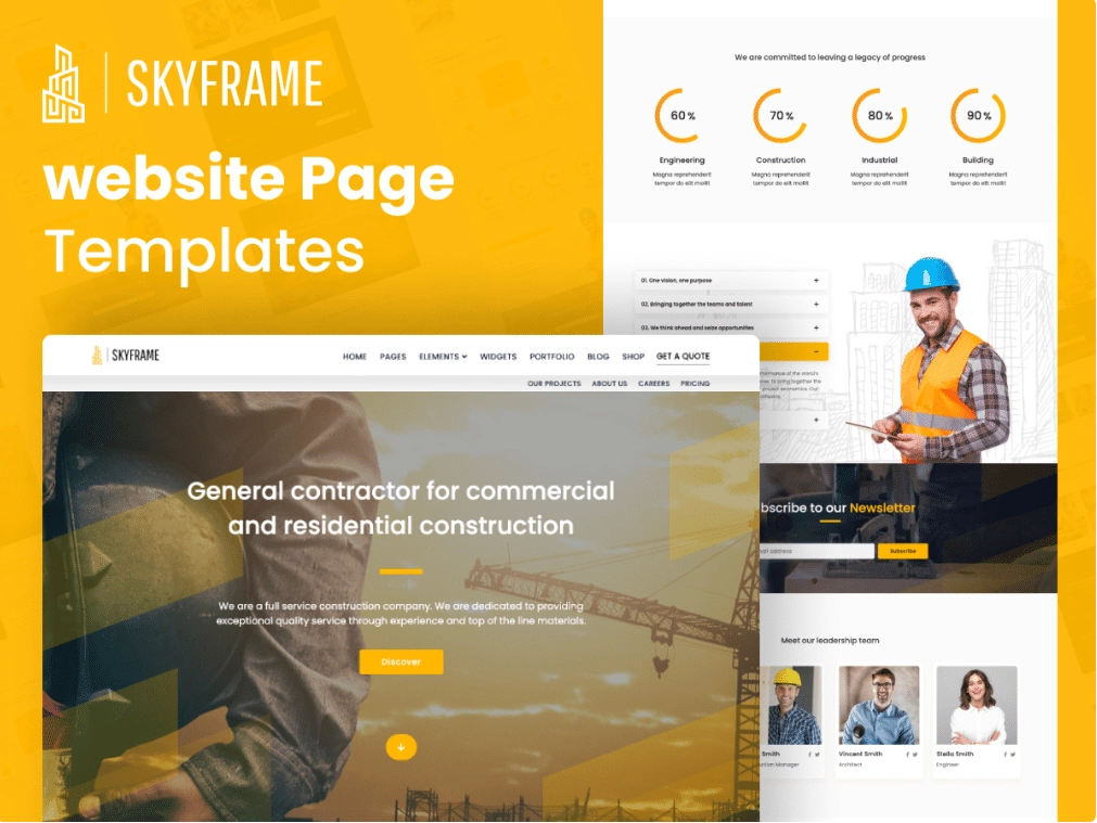
This landing page sample is mainly designed for factory, construction, and real estate businesses. The design is very simple and clear and focuses on showing the company’s project.
The home page consists of a hero section where you can showcase your company logo or relevant images and under that header section there is a slider or hero image area that can be used to highlight your best projects or services.
Moreover, the template provides a contact page with a customizable contact form, allowing visitors to easily get in touch with your company.
What makes this landing page unique?
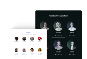
- Team Member Profiles: This landing page has a dedicated section to showcase team member profiles including names, photos, roles, and short biographies.
- Contact Forms: Built-in custom contact forms allow visitors to get in touch quickly with the business and submit inquiries or requests.
- CTA Buttons: The color contrast used in the buttons is attractive and persuasive which makes it more clickable.
Suggested Reading: 7 Best Elementor Landing Page Templates [Ready-to-Use]
6. PureSkin
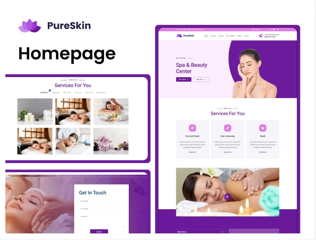
If you are in a business where you provide services like beauty salons, spas, etc then this landing page design is for you.
The homepage welcomes visitors with a beautiful full-width slider showcasing serene spa images, creating a sense of relaxation and tranquility.
There are various sections showcasing different offered services such as massages, facials, body treatments, and more.
Also, there is a functionality of an online booking system where customers can check the availability of the beauticians, and can check opening hours to book appointments accordingly directly from their phones.
What makes this landing page unique?
- Social media integration: There are multiple social media options integrated so that users can easily connect with the company.
- Gallery and portfolio options: You can showcase your various services and works through video, and image gallery as well as a portfolio section.
- Newsletter subscription: You can collect email from your website visitors and can send out regular updates, new product launches, etc.
7. BreadBistro
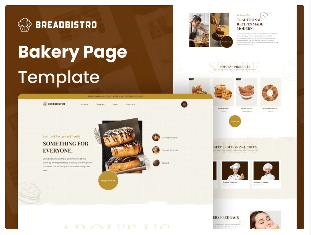
Bread Bistro’s landing page sample is very unique and captivating and designed mainly for bakeries and related businesses.
Its modern and visually appealing designs create an inviting atmosphere for visitors. The homepage displays a header with a slideshow of delicious and mouthwatering images.
There are also different sections for various bakery items such as bread, pastries, and cakes. Also, there is an online ordering system available, allowing customers to easily browse and select their favorite treats for pickup or delivery.
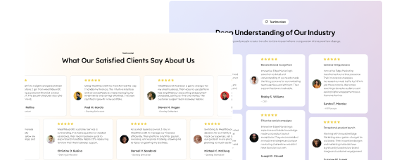
Also, there is a section for customer testimonials, creating trust and credibility for the bakery.
What makes this landing page unique?
- Responsive Design: This landing page is highly responsive and looks great on any device.
- Customizable Layout: If you want to customize the layout of this template then there are various layout options available such as different header styles, page templates, and widget areas to create a unique and personalized website.
- WooCommerce Integration: With the help of WooCommerce integration you can allow your customers to order their favorite cookies directly from the website, instead of visiting the store.
8.NexaByte
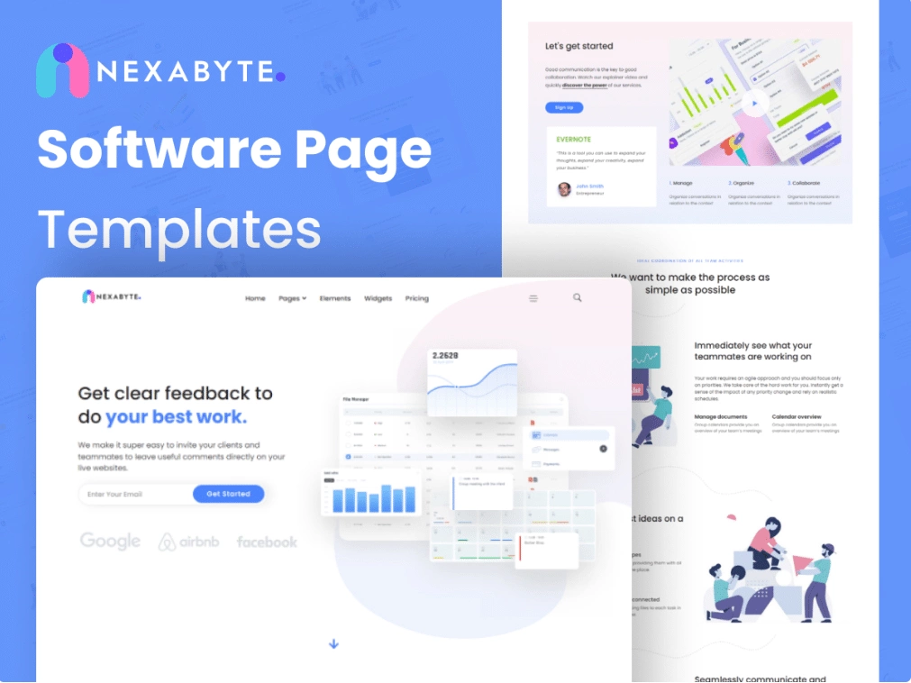
This b2b landing page example is very simple and minimalistic and is mainly designed for technology companies and startups.
The home page includes a full-width hero section where you can display the company name, highlight the company’s motto, and a call to action button to allow your users to take action.
Also, there is a different custom section where you can showcase services, client testimonials, Team members, etc.
With its highly customizable and responsive functionality, it is best for B2B businesses.
What makes this landing page unique?
- Engaging Desgin: The design of this theme is very engaging and eye-catching.
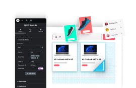
- Search Bar: This landing page offers a real time search bar which helps visitors to find specific section faster and easier.
- CTA Buttons: The Color contrast use for buttons are engaging and attractive which make buttons more clickable.
Wrapping Up
Landing pages are important for any business aiming to generate leads, increase conversions, and increase sales
Creating a successful landing page can be challenging, but with the right approach and design, it can be a powerful tool to convert visitors into customers.
The landing page you are creating should be simple and easy to navigate. Visitors should be able to quickly understand what the page is about and what action they need to take.
Remember, a landing page has one goal: to get the visitor to take a specific action, such as filling out a form, downloading an ebook, or making a purchase.
This can be achieved through clear and concise headlines, subheadings, and bullet points.
Also, the success of your landing page is measured by its conversion rate, so it’s important to track and analyze metrics like bounce rate, time on page, conversion rate, and click-through rate.
Moreover, if you are looking for highly customizable page templates, website templates, and sections for your Elementor or Gutenberg websites then we highly recommend you use WDesignKit.
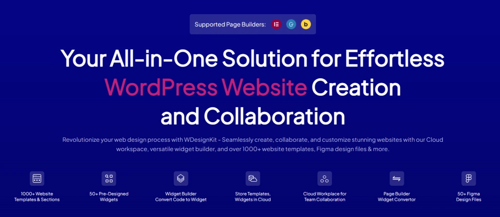
It has 2000+ Ready-made templates, 200+ page templates, and 100+ website templates. Not only that it has 50+ widget builders for Elementor that make the website creation process smoother and faster.
