


Blockquotes can be an effective way to highlight certain parts of content. Blockquotes effortlessly draw attention to key information, making it stand out this way you can enhance the user experience and readability.
With the Blockquote widget from The Plus Addons for Elementor, you can easily highlight important parts of content on your Elementor website.
Required Setup
- Elementor FREE Plugin installed & activated.
- You need to have The Plus Addons for Elementor plugin installed and activated.
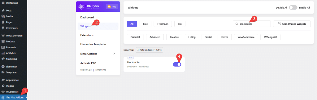
- Make sure the Blockquote widget is activated. To verify this, visit The Plus Addons → Widgets → and search for Blockquote and activate.
Learn via Video Tutorial:

How to Activate the Blockquote Widget?
Go to
- The Plus Addons → Widgets
- Search the widget name and turn on the toggle.
Key Features
- Multiple styles – You can easily choose from multiple styles.
- Add image – You can easily add an image.
- Add tweet button – You can easily add a tweet button to tweet the page or the blockquote content.
How to Add a Blockquote in Elementor for Free?
To add a blockquote in Elementor, add the Blockquote widget to the page.
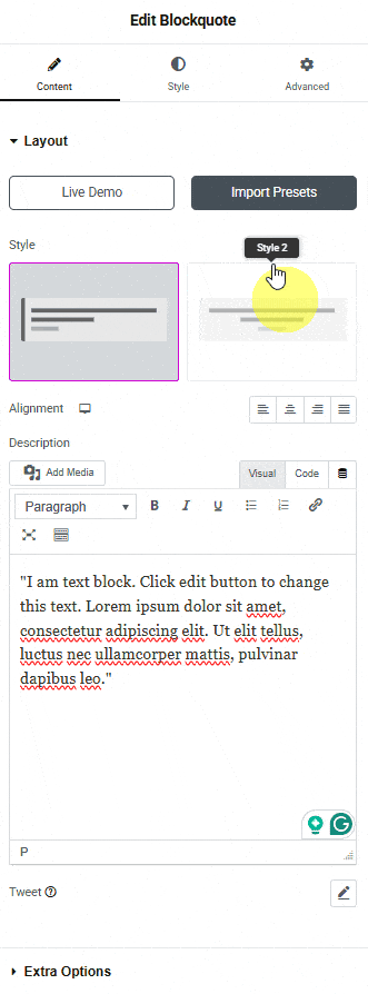
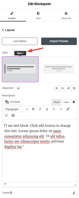
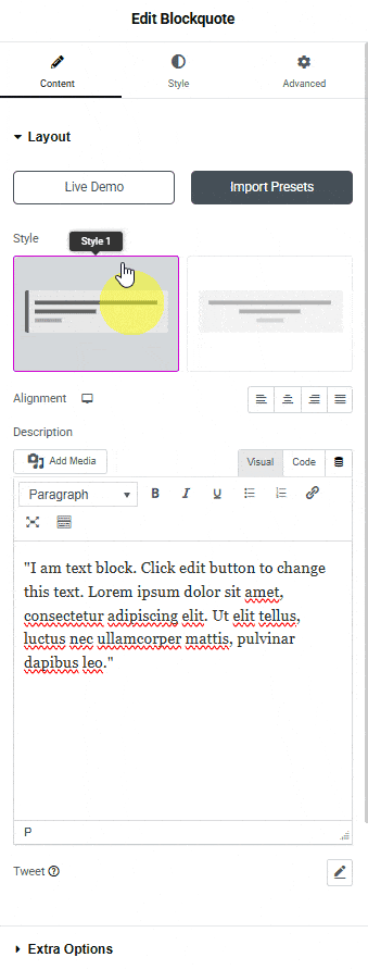
Layout
In the Style section, you’ll find two styles.
Let’s select Style 2 here.
Then, from the Alignment section, you can align the blockquote content for responsive devices.
Then, in the Description section, you have to add the content for the blockquote.
In the Author field, you can add the author’s name.
In the Author Description field, you can add the author’s description.
Note: The Author and Author Description are only available for Style 2.
From the Icon group control, you can add an icon or SVG to the blockquote using the Icon Library section.
From the Position dropdown, you can set the icon position to Top, Bottom, or Both.
From the Alignment dropdown, you can set the icon alignment to Left or Right.
From the Tweet group control, you can add an icon or SVG to the tweet button using the Tweet Icon section.
In the Text field, you have to add the twitter button text.
By enabling the Tweet Current Page toggle, you can tweet using the current page URL.
From the Image toggle, you can add an image to the blockquote using the Select section.
Note: In Style 1 you won’t find the Icon and Image toggles.
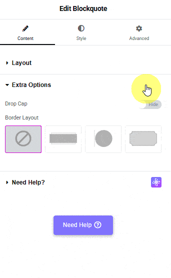
Extra Options
When Style 1 is selected, you’ll see the Drop Cap toggle. From here, you can add a drop cap to the blockquote content.
Note: A drop cap is a big and fancy first letter you might see at the beginning of a story or a chapter. It’s made to look special and stands out from the other letters.
From the Border Layout section, you can select from different pre-defined layouts.
How to Style the Blockquote Widget in Elementor?
You can style the Blockquote from the Style tab. Styling options will vary for Style 1 and Style 2.
Typography – From here, you can manage the blockquote content style.
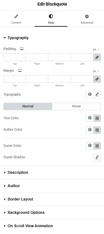
Description – From here, you can manage the blockquote content padding and margin.
Drop Cap – You’ll see this option when Drop Cap is enabled in Style 1. From here, you can manage the drop cap style.
Author – You’ll see this option when Style 2 is selected. From here, you can style the author name and description separately.
Background Options – From here, you can style the blockquote container background.
On Scroll View Animation – This is our global extension available for all our widgets, which adds scrolling animation as the widget comes into the viewport. You can learn more about this from here.
Advanced options remain common for all our widgets; you can explore all their options from here.