Adding a process step is a great way to visually represent a process or workflow and guide users through it. They not only provide a clear and organized way for users to navigate through a process but also enhance the overall user experience.
With the Process Steps widget from The Plus Addons for Elementor, you can easily create beautiful process steps in Elementor.
Check the Live Widget Demo
Required Setup
- Elementor FREE Plugin installed & activated.
- You need to have The Plus Addons for Elementor plugin installed and activated.
- This is a Premium widget, and you need the PRO version of The Plus Addons for Elementor.
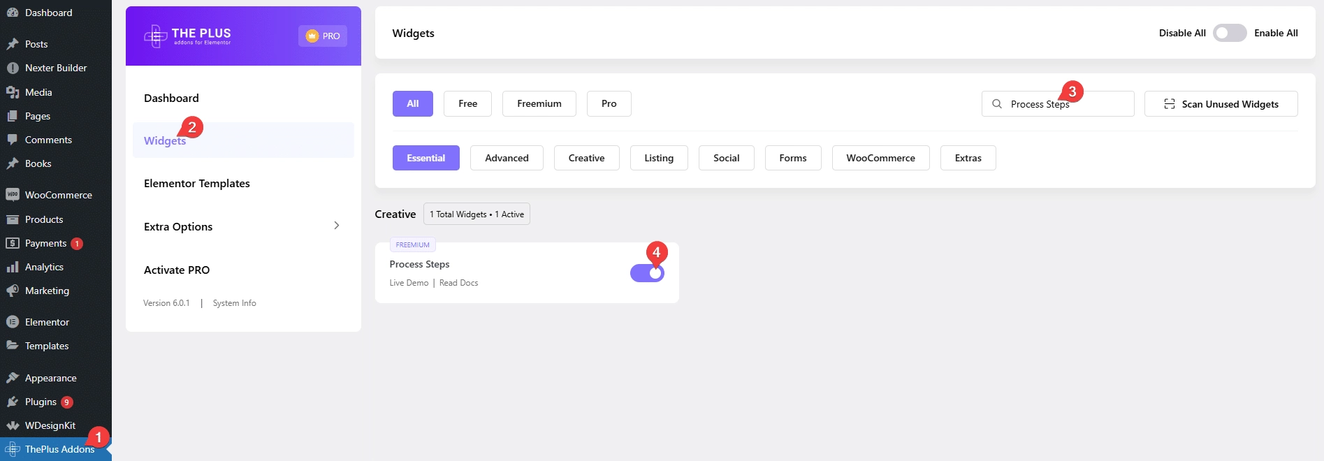
- Make sure the Process Steps widget is activated, to verify this visit The Plus Addons → Widgets → and Search for Process Steps and activate.
Learn via Video Tutorial:
How to Activate the Process Steps Widget?
Go to
- The Plus Addons → Widgets
- Search the widget name and turn on the toggle.
Key Features
- Two Layout Styles – You can select from horizontal and vertical styles.
- Display Counter – You can show different types of counters on the steps.
- Carousel Anything Connection – You can easily sync with the Carousel Anything widget.
How to Use the Process Steps in Elementor?
Add the Process/Steps widget to the page.
From the Style dropdown, you have to select the layout style. Here you’ll find two options –

- Vertical – To create vertical process steps.
- Horizontal – To create horizontal process steps.
Select the options as per your requirements, let’s select Horizontal here.
By enabling the Display Counter toggle, you can add a step counter.
From the Counter Style dropdown, you can select different types of counter styles.
Note: With the Custom Text option you can add custom step text in each step repeater item.
Then, you can add a ripple type background from the Special Background toggle.
By enabling the Normal Layout In Mobile toggle, you can show the steps as normal blocks on mobile screens, but if disabled it will turn to vertical steps on mobile screens.
You can align the step circles from the Circle Alignment section for responsive devices.
Then from the Content Alignment section, you can change the content alignment for responsive devices.
From the Default Active dropdown, you can select which step to set as active, this will add hover color to the selected step.
Then from the Process/Steps section, you have to add the process step content. By default, you’ll find three repeater items, open one item.
In the Title field, you have to add the step title.
Then in the Description section, you can add the step content.
From the Select Icon dropdown, you can select the content type you want to add to the step circle. Here you’ll find five options –
- None – To keep the step circle blank.
- Icon – To add an icon to the step circle.
- Image – To add an image to the step circle.
- Text – To add text to the step circle.
- Lottie – To add an animated Lottie to the step circle.
You’ll see different options to add content based on your selection.
Select the option as per your requirements, let’s select Icon here.
From the Icon Font dropdown, you can select the icon library, and from the Icon Library section, you can add your icon.
By enabling the Icon Link toggle you can add a link to the step circle.
In the Link field, you can add a custom link to the step item.
Then from the Normal Background Option and Hover Background Option sections, you can add backgrounds for the normal and hover states of the step circle.
If you’ve selected Custom Text as the counter style then from the Display Counter Custom Text section you can add a custom counter for the step item.
Following this process you can edit the other items.
You can click on the + Add Item button to add more steps.
By enabling the Carousel Anything Connection toggle, you can connect the steps with the Carousel Anything widget.
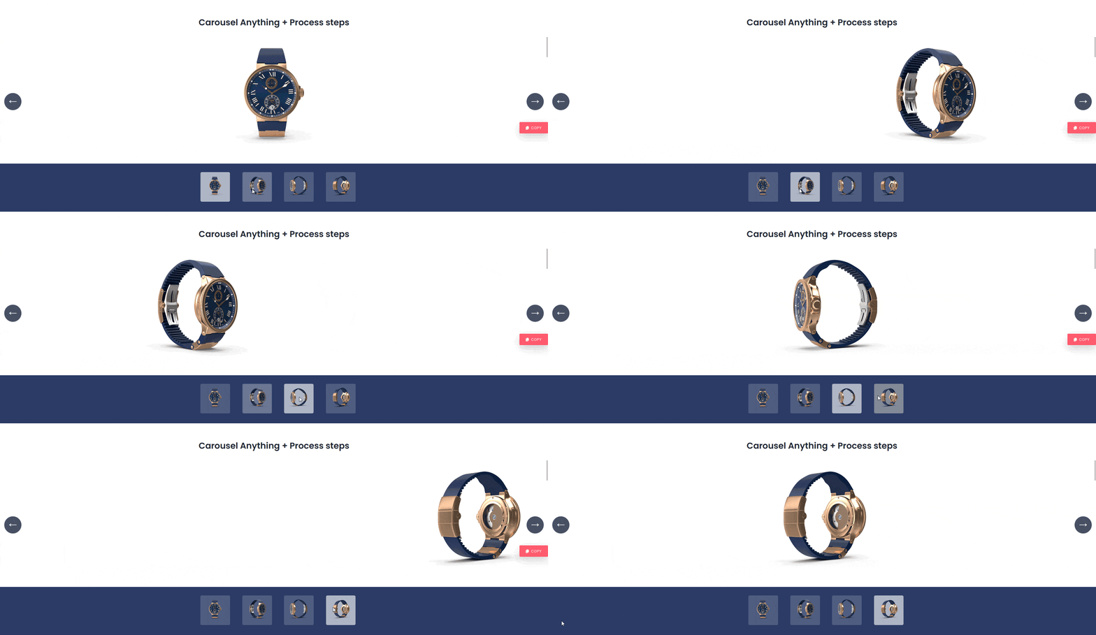
You can watch the video to learn the process.
How to Style the Process Steps Widget?
To style the Process Steps widget you’ll find all options in the Style tab.
Title Style – From here, you can style the step title.
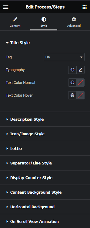
Description Style – From here, you can style the step description.
Icon/Image Style – From here, you can manage the style of icon and image in the step circle.
Lottie – From here, you can style the Lottiefiles.
Separator/Line Style – From here, you can style the connecting lines.
Display Counter Style – You’ll see this option only when the display counter toggle is enabled in the content tab. From here, you can style the counter in the step circle.
Content Background Style – From here, you can style the step content area.
Horizontal Background – You’ll see this option only when the horizontal style is selected. From here, you can add margin and padding to the horizontal step items.
On Scroll View Animation – This is our global extension available for all our widget, this adds scrolling animation as the widget comes in viewport. You can learn more about this from here.
Learn more about On Scroll View Animation
Advanced options remain common for all our widget, you can explore all it options from here.
