


Adding charts and graphs can display data in a visually appealing and easy-to-understand manner. For website designers and creators, incorporating charts into their content can greatly enhance the user experience and make information more engaging.
With the Chart widget from The Plus Addons for Elementor, you can easily add different types of charts to your Elementor website.
Required Setup
- Elementor FREE Plugin installed & activated.
- You need to have The Plus Addons for Elementor plugin installed and activated.
- This is a Premium widget, and you need the PRO version of The Plus Addons for Elementor.
- Make sure the Chart widget is activated. To verify this, visit The Plus Addons → Widgets → and search for Chart and activate.
Learn via Video Tutorial:

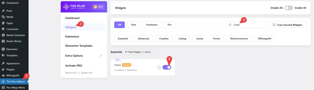
How to Activate the Chart Widget?
Go to
- The Plus Addons → Widgets
- Search the widget name and turn on the toggle.
Key Features
- Line chart – You can easily add a line chart.
- Bar chart – You can easily add a bar chart (horizontal and vertical).
- Radar chart – You can easily add a radar chart.
- Doughnut & Pie chart – You can easily add a doughnut and pie chart.
- Polar Area chart – You can easily add a polar area chart.
- Bubble chart – You can easily add a bubble chart.
How to Add a Line Chart in Elementor?
Add the Chart widget to the page.
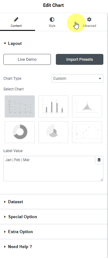
Layout
From the Chart Type dropdown, you have to select the Chart Type. Here you’ll find three options –
- Custom – To add a custom chart.
- CSV File – To add a chart using a CSV file.
- Google Sheet – To add a chart using a Google Sheet.
Depending on the chart type, options will change.
From the Select Chart section, you have to select the chart type. Here you’ll find six options –
Line – To add a line chart.
Bar – To add a bar chart (horizontal and vertical).
Radar – To add a radar chart.
Doughnut & Pie – To add a doughnut and pie chart.
Polar Area – To add a polar area chart.
Bubble – To add a bubble chart.
Note: For some chart types you’ll get additional options.
Let’s select Line here.
Then, in the Label Value field, you have to add chart labels separated by a pipe sign (|).
Dataset
In this tab, you have to add the chart dataset. By default, you’ll find three items open, one item –
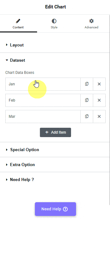
Note: The options will vary for different chart types.
In the Label field, you can add the dataset label.
Then, in the Data field, you have to add the values of the dataset separated by a pipe sign (|). Make sure to add the same number of data points as added in the Label Values field of the Chart tab.
By enabling the Multiple Dot Background toggle, you can change the individual dataset dot background color. To do so, you have to add the color hex codes in the Dot Background field, separated by a pipe sign (|). Make sure that the number of colors added matches the quantity of data entries in the Data field.
But if the Multiple Dot Background toggle is disabled, you can change all the dot background colors at once from the Dot Background section.
Similarly, from the Multiple Border toggle, you can change the individual dataset dot border color. In the Dot Border field, you have to add the color hex codes separated by a pipe sign (|).
But you can change all the dataset dot border colors at once from the Dot Border field by disabling the Multiple Border toggle.
Then, from the Fill toggle, you can add or remove the fill color.
Note: Fill only works for the Line and Radar chart.
By enabling the Border Dash toggle, you can make the line dashed.
Note: Border Dash only works for the Line and Radar chart.
Following this process, you can edit the other items.
Then you can click on the + Add Item button to add more items.
Special Option
In this tab, you’ll find some additional options.
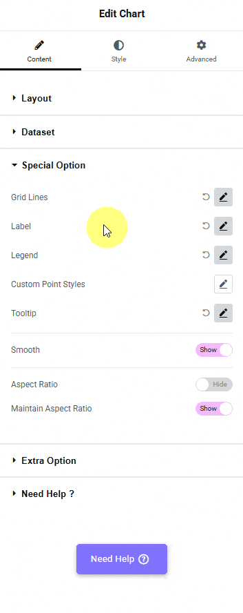
Note: The options will vary for different chart types.
From the Grid Lines group control, you can show or hide the grid. When enabled, you’ll find some options –
From the X Axis tab, you can style the x-axis lines of the grid.
- Grid Color X Axis – From here, you can color the x-axis lines of the grid.
- Zero Line Color – From here, you can color the x-axis baseline of the grid.
- Draw Border – From here, you can show or hide the x-axis baseline of the grid when the Draw Border on Chart Area is disabled.
- Draw Border on Chart Area – From here, you can show or hide the x-axis lines of the grid.
From the Y Axis tab, you can style the y-axis lines of the grid.
- Grid Color Y Axis – From here, you can color the y-axis lines of the grid.
- Zero Line Color – From here, you can color the y-axis starting line of the grid.
- Draw Border – From here, you can show or hide the y-axis starting line of the grid when the Draw Border on Chart Area is disabled.
- Draw Border on Chart Area – From here, you can show or hide the y-axis lines of the grid.
From the Labels group control, you can show or hide the dataset labels from the chart. When enabled, you can manage the label color and size.
Then, from the Legend group control, you can show or hide the labels. When enabled, you can manage the size, color, position, and alignment.
Then you can customize the chart points by enabling the Custom Point Styles group control.
- Point Styles – From here, you can choose different pointer styles.
- Point Background – From here, you can change the pointer background color.
- Point Normal Size – From here, you can set the pointer size.
- Point Hover Size – From here, you can set the pointer size for hover.
- Point Border – From here, you can set the pointer border color.
- Point Border Width – From here, you can set the pointer border width.
From the Tooltip group control, you can show or hide the pointer tooltip. When enabled, you’ll find some customization options.
- Event – From here, you can choose to show the tooltip on hover or click.
- Font Size – From here, you can manage the tooltip content font size.
- Title Color – From here, you can manage the tooltip title color.
- Body Font Color – From here, you can manage the tooltip content color.
- Tooltip Background – From here, you can manage the tooltip background color.
By enabling the Smooth toggle, you can make the line curves smooth.
Then, from the Aspect Ratio toggle, you can make the chart width and height equal.
From the Maintain Aspect Ratio toggle, you can set a custom height for the chart.
Extra Option
In this tab, you’ll find some animation effect options.
You can add different pre-defined animations for datasets to show on page load from the Animation dropdown.
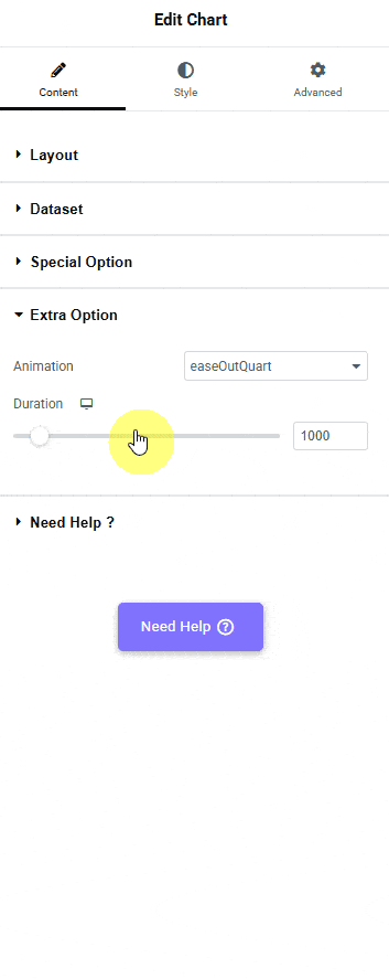
You can control the animation speed from the Duration section.
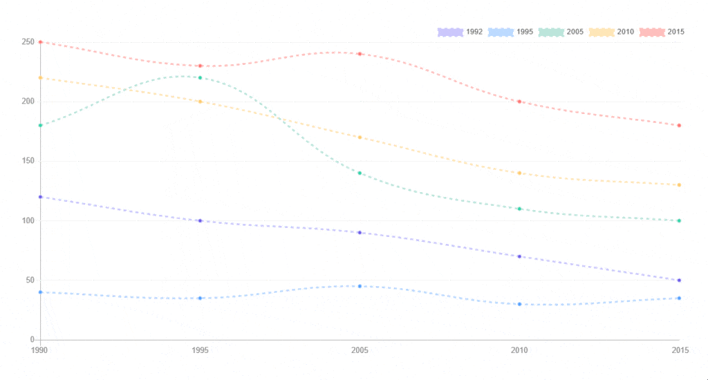
Now you should have a beautiful interactive line chart.
Advanced options remain common for all our widgets, you can explore all their options from here.