For a mobile friendly website, an essential element is the toggle menu, which allows users to easily navigate through different sections of the website.
With the Navigation Menu widget from The Plus Addons for Elementor, you can easily add a toggle button for the mobile menu.
To check the complete feature overview documentation of The Plus Addons for Elementor Navigation Menu widget, click here.
Requirement – This widget is a part of The Plus Addons for Elementor, make sure its installed & activated to enjoy all its powers.
To do this, add the Navigation Menu widget to the header template and follow the steps –
Note: To create the header template, you can use the free Nexter Builder or you can use Elementor Pro if you are already using it.
1. From the Navigation Bar tab, select the appropriate Menu Type, Menu Direction and menu.
2. Then go to the Mobile Menu tab and enable the Responsive Mobile Menu toggle.
3. From the Menu Type dropdown, select Toggle.
In the Open Mobile Menu section, you can specify the minimum width for enabling the mobile menu.
From the Toggle Style dropdown, you can select different toggle styles or can use a custom icon or image as the toggle button.
From the Toggle Alignment section, you can align the toggle button.
Also read, how to create a vertical menu in Elementor.
From the Navigation Alignment section, you can align the mobile menu items.
4. Then, from the Menu Content dropdown, you can select the menu content type. Here you’ll find two options –
Normal Menu – To use a WordPress default menu as a mobile menu.
Template Menu – To use an Elementor template as a mobile menu.
Let’s select the Normal Menu here.
5. From the Select Menu dropdown, you have to select your menu.
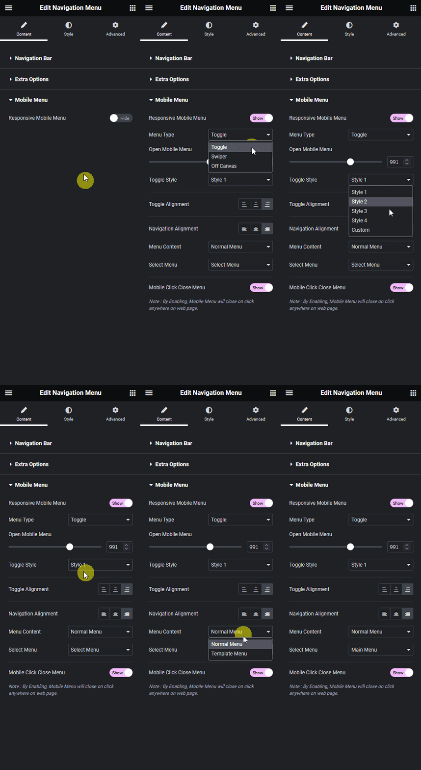
Now, you’ll see a toggle button to open the menu on mobile.

Also, read how to create an off canvas mobile menu in Elementor.
