


Do you want to import data from Google Sheets to an Elementor chart? Importing data from Google Sheets into an Elementor chart offers a seamless way to display and manage dynamic content on your website. By integrating Google Sheets with Elementor, you can effortlessly update and synchronize your data in real time, ensuring that your chart is always up to date.
With the Chart widget from The Plus Addons for Elementor, you can import data from your Google Sheets directly into an Elementor table, eliminating the need for manual data entry and streamlining your workflow.
To check the complete feature overview documentation of The Plus Addons for Elementor Chart widget, click here.
Requirement – This widget is a part of The Plus Addons for Elementor, make sure it’s installed & activated to enjoy all its powers.
To do this, first, you have to generate a Google API Key.
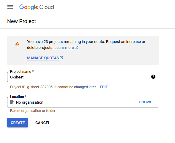
1. Login to your Google account and go to the Google Developers Console.
2. If you don’t have any projects created, then click on CREATE PROJECT link.

3. On the next screen, add your Project name and click the CREATE button.
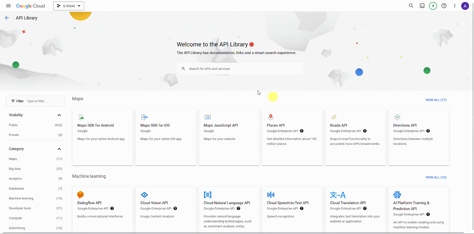
4. Then click on +ENABLE APIS AND SERVICES at the top.
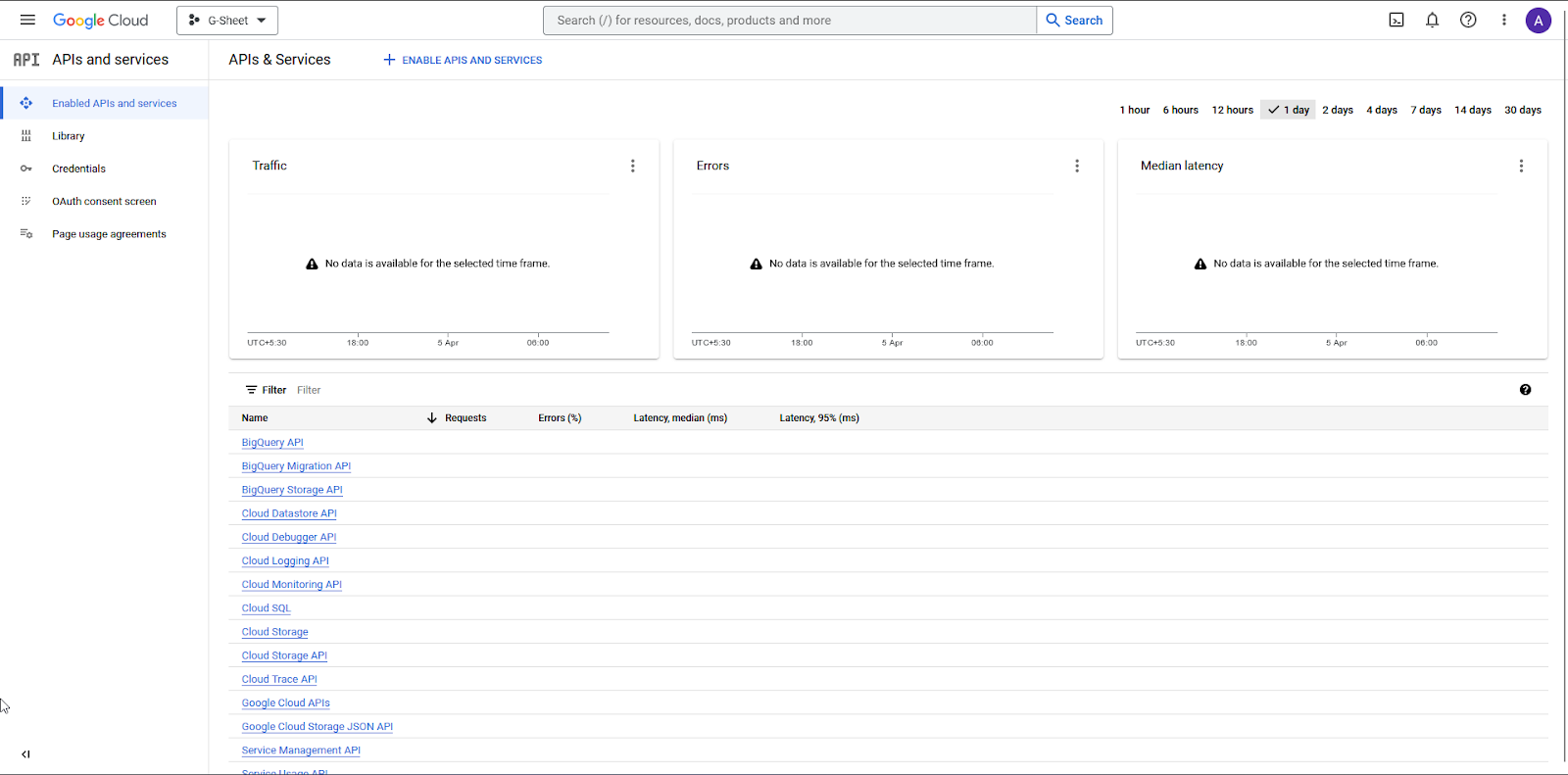
5. On the next page, search for Google Sheets API in the search bar. Click on Google Sheets API, then click on the Enable button.
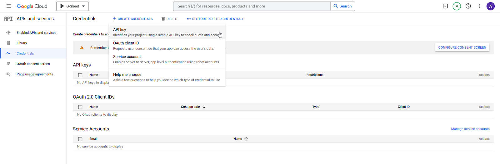
6. Then click on Credentials in the left sidebar.
7. On the Credentials page, from the top, click on + CREATE CREDENTIALS > API Key.
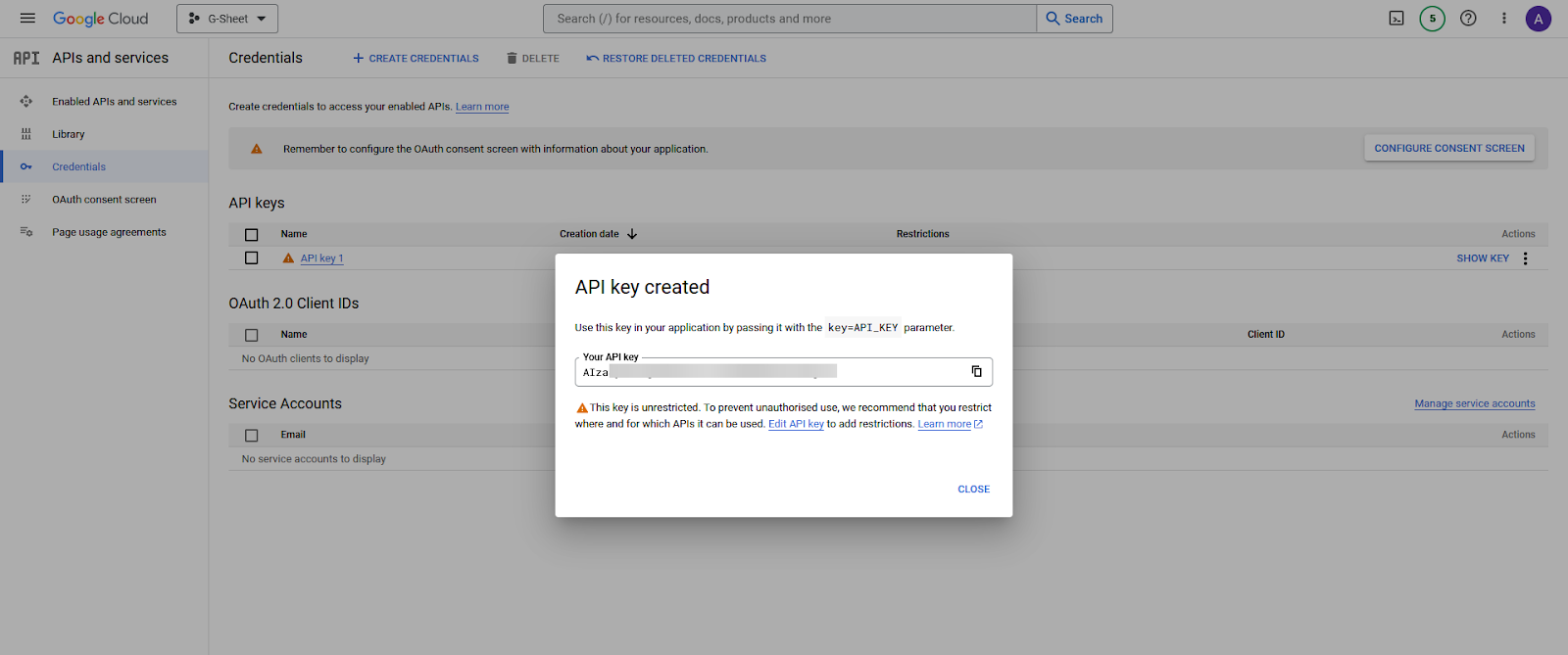
8. It will generate the API Key, and you will copy and paste the key into a notepad.
In the same Google account that you generated the API key with, you should have a Google Spreadsheet with some data.
Now, to import Google Sheet data into the Elementor chart with the Chart widget, follow the steps –
1. Add the Chart widget on the page, then select Google Sheet from the Chart Type dropdown.
2. In the API Key field, paste your API Key.

3. Go to your Google Spreadsheet, and click on the Share button. In the popup, set the General Access to Anyone with the link and click on Done.

This will allow the Chart widget to access your Spreadsheet.
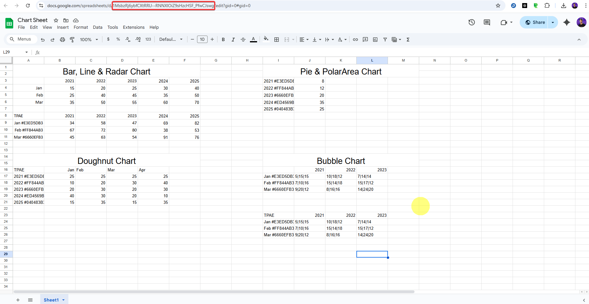
4. Now, you have to find your Google Sheet ID. You can find the spreadsheet ID in the spreadsheet URL.
Then your ID should be “1MsbzRj6ybfCXtRRU–RNNXlOiZ9sHzcHSF_PfwCJswg”
5. Copy and paste your spreadsheet ID in the Sheet ID field of the Chart widget.
6. In the Table Range field, you have to add the cell range of your Google Spreadsheet, which you want to show in your Elementor chart.
Go to your Spreadsheet, select the range, and then click on Data > Named ranges.
It will show the cell range, copy and paste it into the Table Range field of the Chart widget.
You can select the Bar type option from the Select Chart section.
Note: In the sheet, we’ve included different types of data formats for various chart types. So, for each chart type (e.g., Bar, Radar, Line), you can refer to the relevant section. As shown in the video above, this applies to the Bar, Radar, and Line charts.
Note: To help you understand how this option works, we’ve shown two examples with data for Bar, Radar, and Line charts below. Just follow the steps.
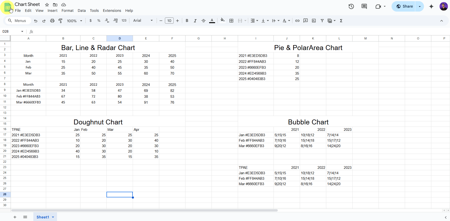
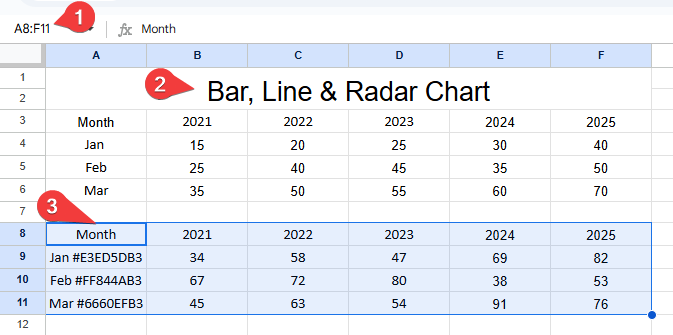
Example 1: Data Without pre-defined Color
You’ll see below your raw data table in Google Sheets. This table is used to generate a chart. The structure follows:
This table is used to generate a chart. The structure follows:
- X-Axis represents → Years (2021 to 2025)
- Y-Axis represents → Values (from the data for Jan, Feb, and Mar), and each row (Jan, Feb, Mar) represents a series on the graph
You can either select all your data or just the specific part you want to see in the graph (like your A3:F6 example). Selecting only the part you need is usually simpler and clearer for that specific graph.
Note: So, if your data is in the first sheet (which Excel usually names “Sheet1” by default) and your table range is A3:F6, the correct way to represent this range is: Sheet1!A3:F6
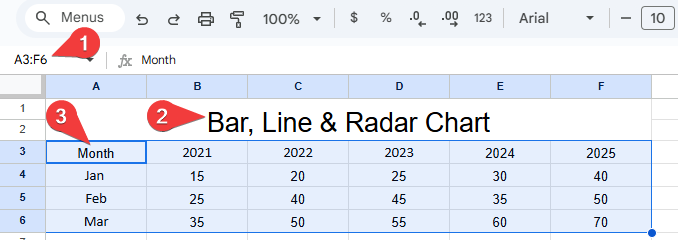
After that, once you have collected the API Key, Sheet ID, and Table Range, the following steps will show how the data from the sheet is visualized in a bar chart.
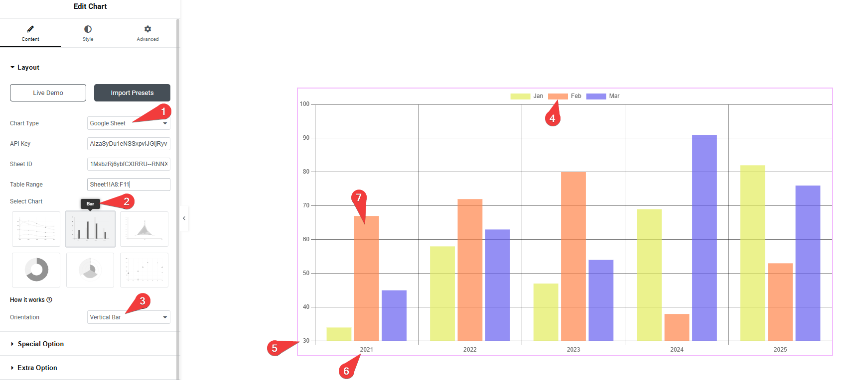
1. Chart Type Source Selection :
- Select Google Sheet from the Chart Type dropdown.
- Enter the correct API Key, Sheet ID, and Table Range to connect to your data.
2. Chart Style Selection:
- Choose Bar from the Select Chart section.
- This choice determines the visual representation of the data, displaying it as vertical bars, useful for comparing quantities across different categories or over time.
3. Chart Orientation :
- Select the Vertical Bar from the Orientation dropdown.
- This specifies that the bars in the chart will be drawn vertically, with categories typically on the horizontal (X) axis and values on the vertical (Y) axis.
4. Color Legend :
- The legend at the top of the chart indicates the categories represented by different colors: Jan (yellow), Feb (greenish-blue), and Mar (black). This allows for easy identification of which bar corresponds to which month.
5. Y-Axis (Values):
- The Y-axis is displayed on the left side of the chart. It represents the quantitative values being measured, ranging from 10 to 70 in this chart. The number 5 points to the starting point of this axis.
6. X-Axis (Years):
- The X-axis is displayed at the bottom of the chart. It represents the categorical data, which in this case are the years from 2021 to 2025. The number 6 points to the starting point of this axis.
7. Bar Heights (Data Representation):
- The height of each bar reflects the value from the sheet
- The number 7 points to the group of three vertical bars for the year 2021. Each bar within this group represents the value for a specific month (Jan, Feb, Mar) for that year, allowing for a direct comparison of values across months for a given year, and also across years.
- For example:
- In 2021: Jan = 15, Feb = 25, Mar = 35
- These are shown as 3 different bars with respective heights for 2021
- In 2021: Jan = 15, Feb = 25, Mar = 35
Note: If your data does not include color hexadecimal codes, the graph will display default colors. These colors will change each time the page loads. Each color represents a different month.
Now, you will see your graph displaying your data.
Example 2: Data with pre-defined Color
Note: In this example, the process is the same as you saw above. The only difference is that here you will pre-define and add colors(hexadecimal codes), so you will be able to see specific colors in the chart’s columns.
7. When you select the Bar chart, you can choose the appropriate chart view from the Orientation dropdown.
Note: To help you understand how this option works, we’ve shown two examples with data for Doughnut, Pie, PolarArea, and Bubble charts below. Just follow the same steps as shown above.
Example 1: Data Without pre-defined Color (Doughnut Chart)
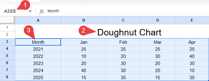
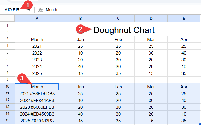
You’ll see below your raw data table in Google Sheets. This table is used to generate a chart. The structure follows:
This table is used to generate a chart. The structure follows:
- Months (Jan, Feb, Mar, Apr).
- Years (2021 to 2025).
- The numeric values from your sheet (e.g., 25, 40, 15…).
You can either select all your data or just the specific part you want to see in the graph (like your A3:E8 example). Selecting only the part you need is usually simpler and clearer for that specific graph.
Note: So, if your data is in the first sheet (which Excel usually names “Sheet1” by default) and your table range is A3:E8, the correct way to represent this range is: Sheet1!A3:E8
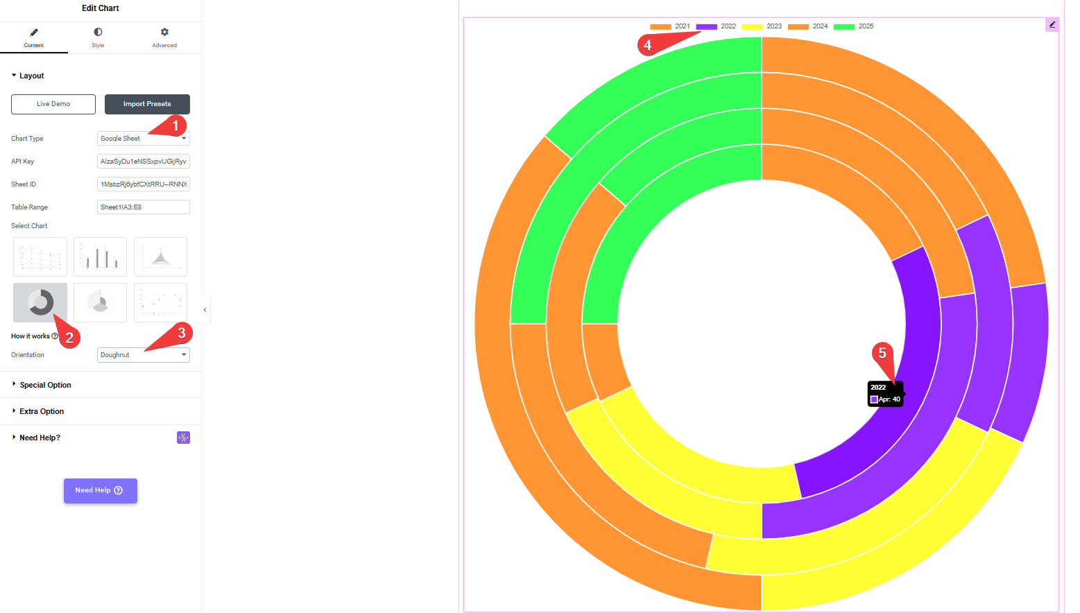
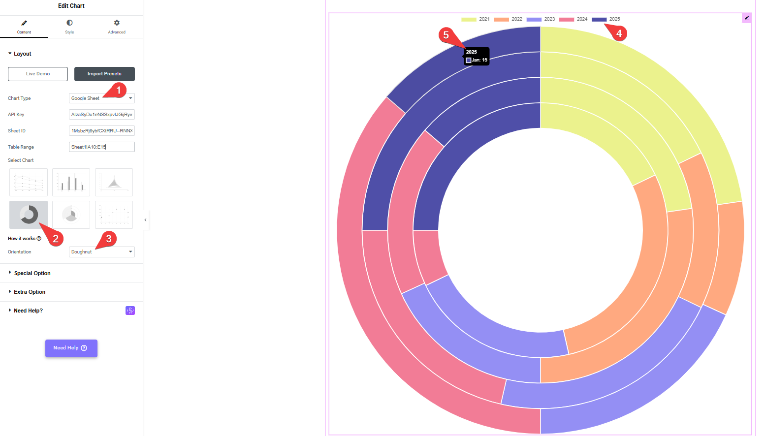
1. Chart Type Source Selection
- Select Google Sheet from the Chart Type dropdown.
- Then enter the values in the API Key, Sheet ID, and Table Range fields.
2. Chart Style Selection
- Click the Doughnut Chart from the Select Chart section.
- This defines the chart style as a doughnut, which displays values in a ring-shaped format.
3. Chart Orientation
- Set the Orientation to Doughnut using the dropdown.
- This ensures that the chart displays in a multi-ring doughnut style, where each ring represents a different year.
4. Color Legend
- The Legend at the top of the chart shows the color-coded key for each year (2021 to 2025).
- Each colored ring in the chart corresponds to a year and helps in identifying the data visually.
5. Data Hover Tooltip
- Hovering over a segment in the chart shows a tooltip with details:
- Year (e.g., 2022)
- Month and Value (e.g., Apr: 40)
- This makes it easier to identify exact values from the data set without going back to the sheet.
Each ring segment reflects a month’s value for a particular year, making it easy to compare values across years visually.
Note: If your data does not include color hexadecimal codes, the graph will display default colors. These colors will change each time the page loads. Each color represents a different month.
Now, you will see your graph displaying your data.
Example 2: Data with pre-defined Color (Doughnut Chart)
Note: In this example, the process is the same as you saw above. The only difference is that here you will pre-define and add colors(hexadecimal codes), so you will be able to see specific colors in the chart’s columns.
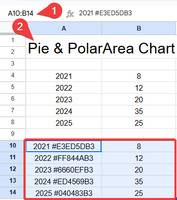
Example 1: Data Without pre-defined Color (Pie Chart)
You’ll see below your raw data table in Google Sheets. This table is used to generate a chart. The structure follows:
This table is used to generate a chart. The structure follows:
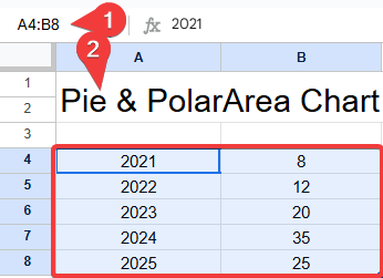
- Years (2021 to 2025). (from column A in the sheet).
- The numeric values from your sheet (e.g., 8, 12, 20…). (from column B in the sheet).
You can either select all your data or just the specific part you want to see in the graph (like your A4:B8 example). Selecting only the part you need is usually simpler and clearer for that specific graph.
Note: So, if your data is in the first sheet (which Excel usually names “Sheet1” by default) and your table range is A4:B8, the correct way to represent this range is: Sheet1!A4:B8
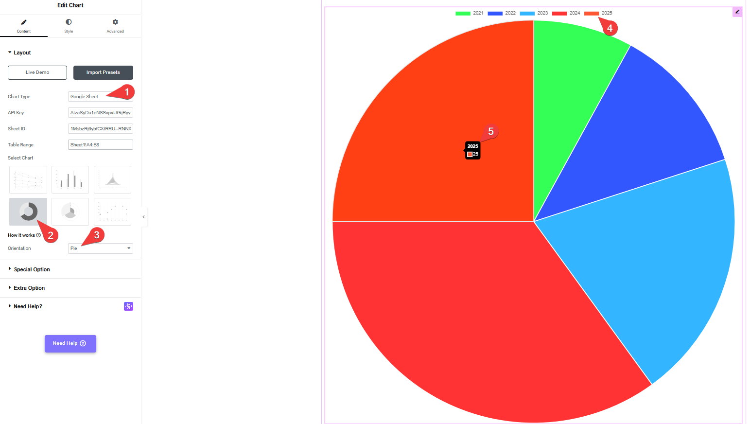
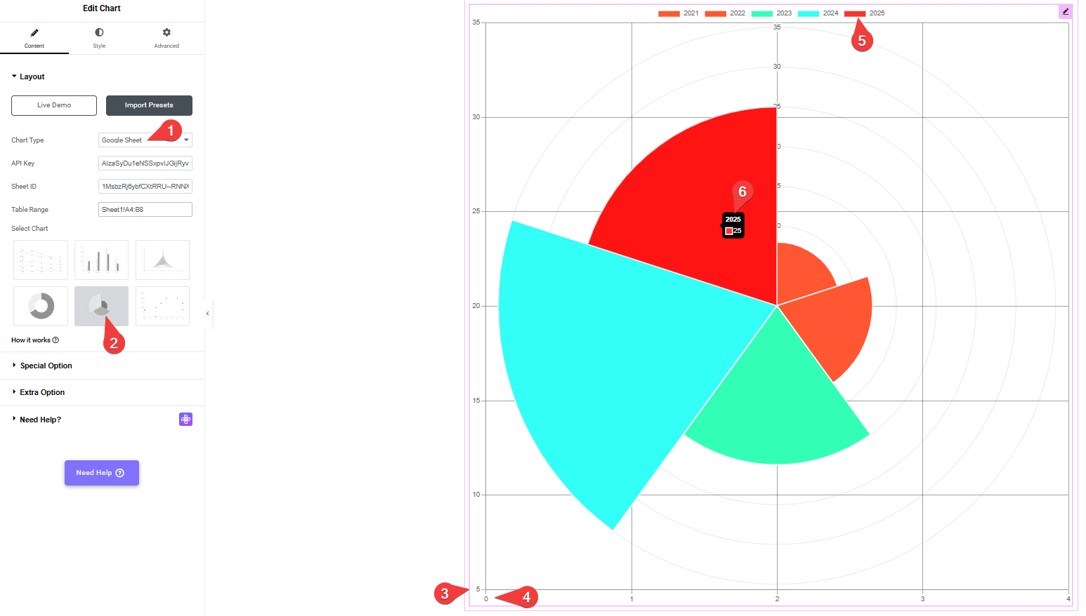
1. Chart Type Source Selection
- Select Google Sheet from the Chart Type dropdown.
- Then enter the values in the API Key, Sheet ID, and Table Range fields.
2. Chart Style Selection
- Click the Pie Chart from the Select Chart section.
- This sets the chart type to Pie, which divides a circle into slices to show proportion.
3. Chart Orientation
- In the Orientation dropdown, select Pie.
- This ensures that the chart renders in a classic pie format where each slice represents a value for a specific year.
4. Color Legend
- The Legend at the top shows which color corresponds to which year (2021 to 2025).
- This helps visually match each slice of the pie to its year.
5. Data Hover Tooltip
- Hovering over any slice displays a tooltip that includes:
- Year (e.g., 2025)
- Value (e.g., 25)
- Year (e.g., 2025)
- This provides quick reference without checking the original data table.
- Slices: Each slice of the pie reflects a year’s total value, showing its proportion relative to the full dataset.
Note: If your data does not include color hexadecimal codes, the graph will display default colors. These colors will change each time the page loads. Each color represents a different month.
Now, you will see your graph displaying your data.
Example 2: Data with pre-defined Color (Pie Chart)
Note: In this example, the process is the same as you saw above. The only difference is that here you will pre-define and add colors(hexadecimal codes), so you will be able to see specific colors in the chart’s columns.

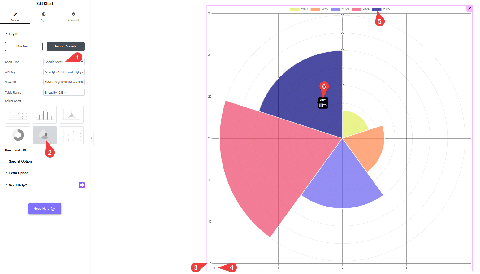
Example 1: Data Without pre-defined Color (Polar Area Chart)
You’ll see below your raw data table in Google Sheets. This table is used to generate a chart. The structure follows:
This table is used to generate a chart. The structure follows:
- Years (2021 to 2025). (from column A in the sheet).
- The numeric values from your sheet (e.g., 8, 12, 20…). (from column B in the sheet).
You can either select all your data or just the specific part you want to see in the graph (like your A4:B8 example). Selecting only the part you need is usually simpler and clearer for that specific graph.
Note: So, if your data is in the first sheet (which Excel usually names “Sheet1” by default) and your table range is A4:B8, the correct way to represent this range is: Sheet1!A4:B8

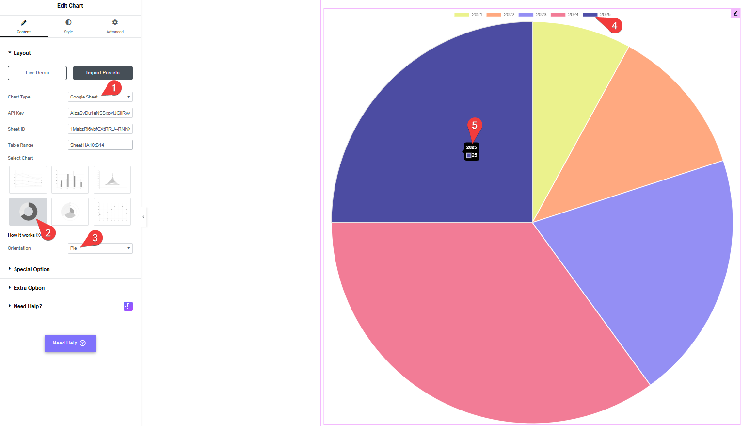
1. Chart Type Source Selection
- Select “Google Sheet” from the Chart Type dropdown.
- Then enter the values in the API Key, Sheet ID, and Table Range fields.
2. Chart Style Selection
- Click the Polar Area Chart from the Select Chart section.
- Sets the chart type to Pie, dividing a circle into slices to show proportions between values.
3. Chart Orientation (Y-Axis – Values)
- Shows the numerical values for each month from the sheet (e.g., 5, 10, 15…)
4. Color Orientation (X-Axis)
- Displays the sequence numbers (e.g., a specific measurement or quantity).
5. Data Hover Tooltip
- This refers to the legend located at the top of the chart display area, showing the years 2021 to 2025 with their corresponding colors.
6. Polar Area Chart Sections
- Hovering over any slice displays a tooltip that includes:
- Year (e.g., 2025)
- Value (e.g., 25)
- Year (e.g., 2025)
- This provides quick reference without checking the original data table.
- Slices: Each slice of the pie reflects a year’s total value, showing its proportion relative to the full dataset.
Note: If your data does not include color hexadecimal codes, the graph will display default colors. These colors will change each time the page loads. Each color represents a different month.
Now, you will see your graph displaying your data.
Example 2: Data with pre-defined Color (Polar Area Chart)
Note: In this example, the process is the same as you saw above. The only difference is that here you will pre-define and add colors(hexadecimal codes), so you will be able to see specific colors in the chart’s columns.
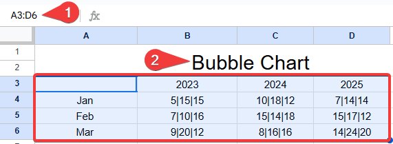
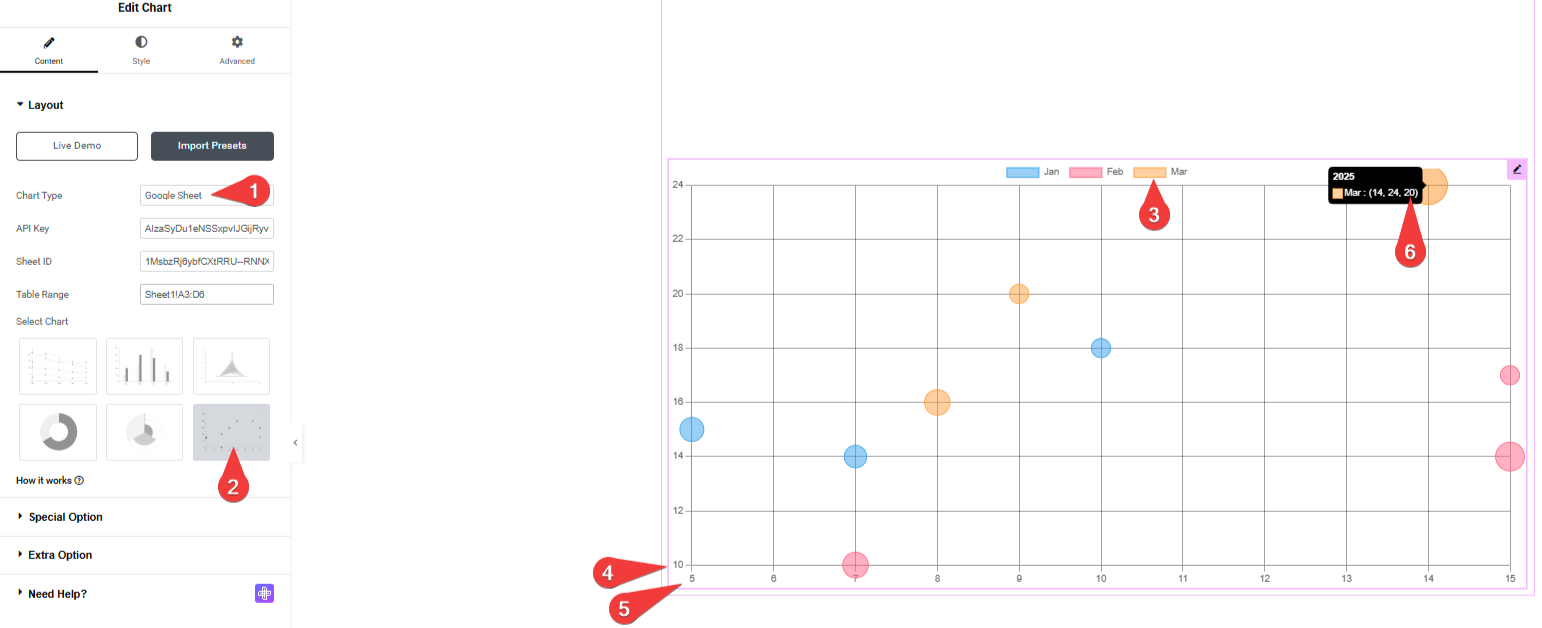
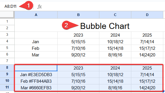
Example 1: Data Without pre-defined Color (Bubble Chart)
You’ll see below your raw data table in Google Sheets. This table is used to generate a chart. The structure follows:
This table is used to generate a chart. The structure follows:
- Years (2023 to 2025).
- Months (Jan to Mar).
- The numeric values from your sheet (e.g., 5|15|25, 10|18|12, 7|14|14…).
You can either select all your data or just the specific part you want to see in the graph (like your A3:D6 example). Selecting only the part you need is usually simpler and clearer for that specific graph.
Note: So, if your data is in the first sheet (which Excel usually names “Sheet1” by default) and your table range is A3:D6, the correct way to represent this range is: Sheet1!A3:D6
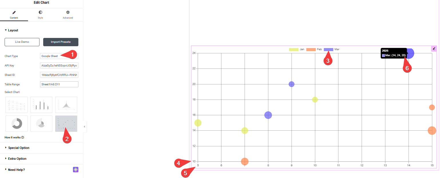
1. Chart Type Source Selection
- Select “Google Sheet” from the Chart Type dropdown.
- Then enter the values in the API Key, Sheet ID, and Table Range fields.
2. Chart Style Selection
- Click the Bubble Chart from the Select Chart section.
- This choice indicates that the data will be visualized as a bubble chart, where each data point is represented by a circle (bubble) whose size can vary based on a third data dimension.
3. Color Legend
- The legend at the top of the chart shows the categories represented by different colors: Jan (blue), Feb (orange), and Mar (pink). This helps in identifying which month each bubble corresponds to.
4. Y-Axis
- The Y-axis is highlighted on the left side of the chart. It represents one of the quantitative dimensions of the data, with values ranging from approximately 10 to 24 in this view. The number 4 points to the starting point of this axis.
5. X-Axis
- The X-axis is highlighted at the bottom of the chart. It represents another quantitative dimension of the data, with values ranging from approximately 5 to 15. The number 5 points to the starting point of this axis.
6. Data Hover Tooltip
- Hovering over a specific bubble (in this case, a pink one representing March) displays a tooltip. The tooltip (marked as 6) provides detailed information for that specific data point, showing:
- Month: Mar (March)
- X-axis value: 14
- Y-axis value: 24
- Bubble size value: 20 (This is the value that determines the size of the bubble, although not explicitly labeled in the tooltip, it’s typically the third dimension in a bubble chart)
Note: If your data does not include color hexadecimal codes, the graph will display default colors. These colors will change each time the page loads. Each color represents a different month.
Now, you will see your graph displaying your data.
Example 2: Data with pre-defined Color (Bubble Chart)
Note: In this example, the process is the same as you saw above. The only difference is that here you will pre-define and add colors(hexadecimal codes), so you will be able to see specific colors in the chart’s columns.
That’s it. Now, data from your Google Spreadsheet will show in your Elementor chart.