Are you looking to add a modern off canvas mobile menu in Elementor? An off canvas menu allows for a more intuitive and compact navigation experience, as it slides in and out of the screen without taking up valuable space.
With the Navigation Menu widget from The Plus Addons for Elementor, you can easily add an off canvas menu for the mobile menu.
To check the complete feature overview documentation of The Plus Addons for Elementor Navigation Menu widget, click here.
Requirement – This widget is a part of The Plus Addons for Elementor, make sure its installed & activated to enjoy all its powers.
To do this, add the Navigation Menu widget to the header template and follow the steps –
Note: To create the header template, you can use the free Nexter Builder or you can use Elementor Pro if you are already using it.
1. From the Navigation Bar tab, select the appropriate Menu Type, Menu Direction and menu.
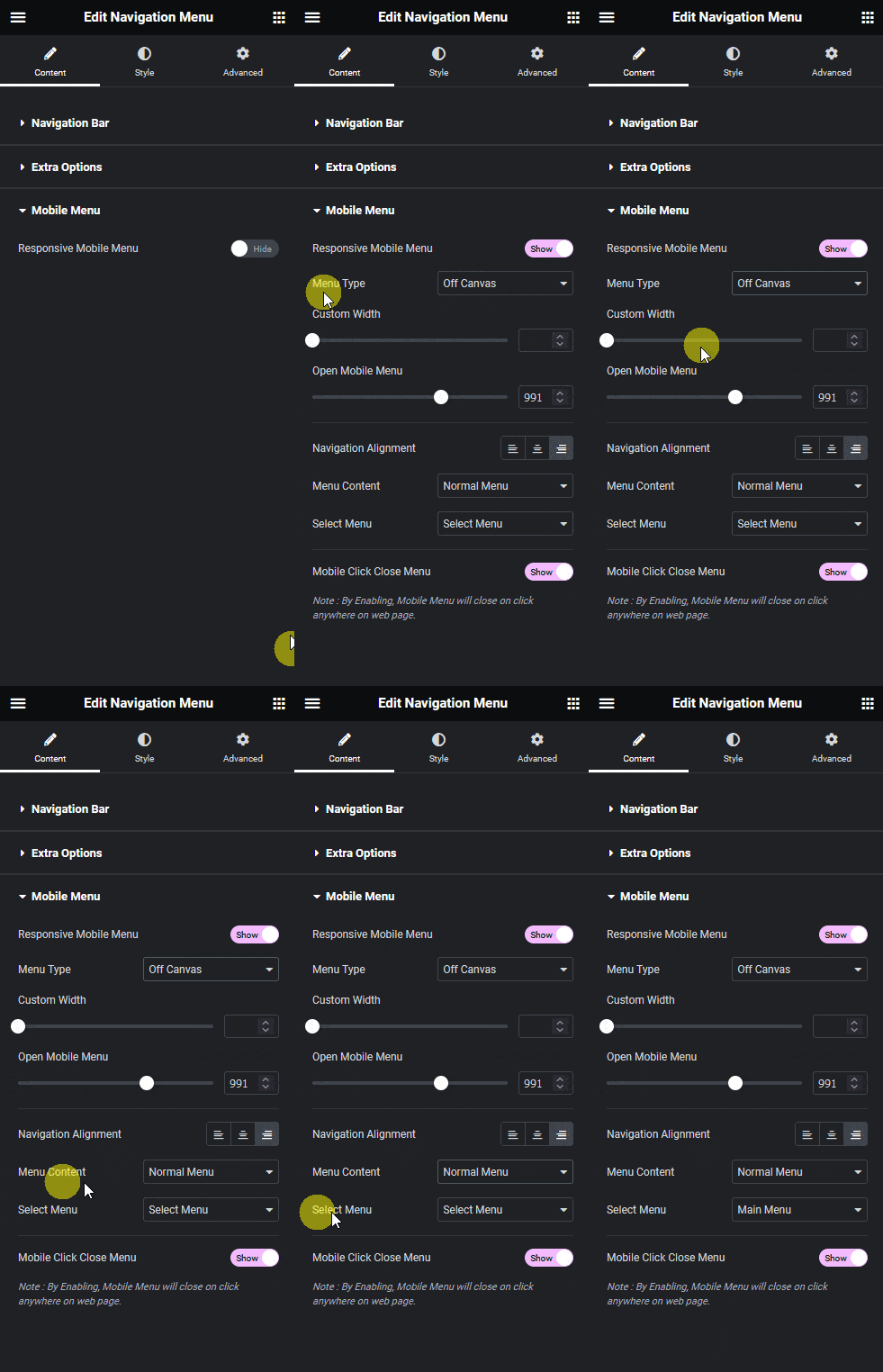
2. Then go to the Mobile Menu tab and enable the Responsive Mobile Menu toggle.
3. From the Menu Type dropdown, select Off Canvas.
From the Custom Width section, you can set the off canvas container width.
In the Open Mobile Menu section, you can specify the minimum width for enabling the mobile menu.
From the Navigation Alignment section, you can align the mobile menu items.
Must read, 8 best mega menu examples + learn how to create them.
4. Then, from the Menu Content dropdown, you can select the menu content type. Here, you’ll find two options –
Normal Menu – To use a WordPress default menu as a mobile menu.
Template Menu – To use an Elementor template as a mobile menu.
Let’s select the Normal Menu here.
5. From the Select Menu dropdown, you have to select your menu.

Now you’ll see a beautiful off canvas menu when you click on the toggle button on mobile.
Also, learn how to create an off-canvas mobile menu in Elementor for a modern touch to your site’s navigation.

Also, read how to create a hamburger mobile menu with Elementor template.


