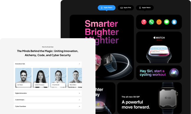
The accordion widget is a helpful little widget that can be used to create an FAQ page. By clicking on the left side of the accordion, it will open up with all the questions. When you click on the right side, it will close up and show you the answers.
It’s a great way to create FAQs for your website or blog post and make it more interactive for your readers! The Plus Addons for Elementor Accordion widget comes with featured packed solutions to make the unique design.
Required Setup
- Elementor FREE Plugin installed & activated.
- You need to have The Plus Addons for Elementor plugin installed and activated.
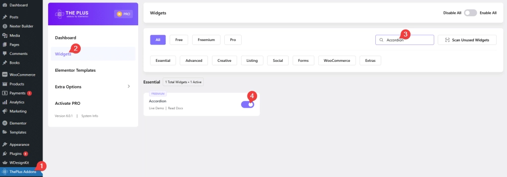
- Make sure the Accordion widget is activated, to verify this visit The Plus Addons → Widgets → and Search of Accordion and activate.
- This is a Freemium widget to unlock the extra features, you need the PRO version of The Plus Addons for Elementor.
Learn via Video Tutorial
How to Activate the Accordion Widget?
Go to
- The Plus Addons → Widgets
- Search the widget name and turn on the toggle.
Key Features
- Multiple content sources – You can choose from Content (Free) or Page template (Pro). When you use the content option as the content source type, you can use any shortcode to display the content in the accordion.
- Easily add standard icons to the accordion (Free) – You can easily add the standard expand and collapse icons for all accordion items.
- Different HTML tag options for accordion heading (Free) – Different HTML tags like H1, H2 etc. can be used for the accordion heading this will improve your SEO.
- Individual icons for each accordion (Pro) – You can use different icons for each accordion item.To use it, turn on the Show icon toggle inside the accordion item and set the icon.
- Unique ID (Pro) – You can add a unique id for each accordion item to easily create anchor links directly to the accordion item.
- Active Accordion (Pro) – Here you can easily set a custom active accordion item or set all to close by default.
- On Hover Accordion (Pro) – You can make the accordion open when someone hovers over the accordion title.
- Horizontal Accordion (Pro)- You can easily turn your vertical accordion into a horizontal accordion.
- Expand/Collapse Content Button (Pro)- Set a button to expand and collapse all accordions at once.
- Scroll Top (Pro)- This option will scroll the active accordion to the top of the screen making it easy for readers to read.
- Stagger Animation (Pro) – With this option, you can display each accordion item one by one with a delay.
- Search (Pro) – You can add a text search functionality within your accordion.
- Slider/Pagination(Pro) – You can easily split your long list of accordions in pagination.
- Autoplay (Pro)- You can make your accordion play automatically from one item to another.
- SEO Schema Markup (Pro)- Turn your accordion into SEO-friendly schema markup.
- Carousel Connection ID (Pro) – You can easily connect the Carousel Anything widget with your accordion with a unique ID. So when a user clicks on an accordion item the slider will also change.
How to add content in Accordion Widget?
To add content to the accordion widget, click on the accordion item you want to add the content to. In the title field, you can add the heading for the accordion tab.
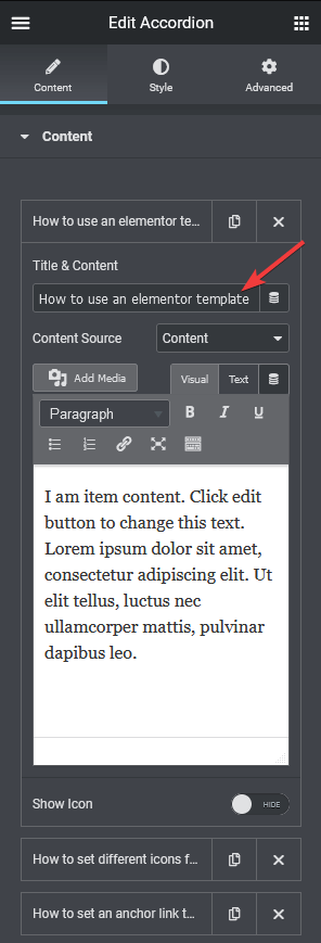
For the content source, there are two options Content (Free) i.e. plain text content and Elementor Page Template (Pro).
If you choose the content option you can enter the text in the editor, or you can use it to render a shortcode content as well.
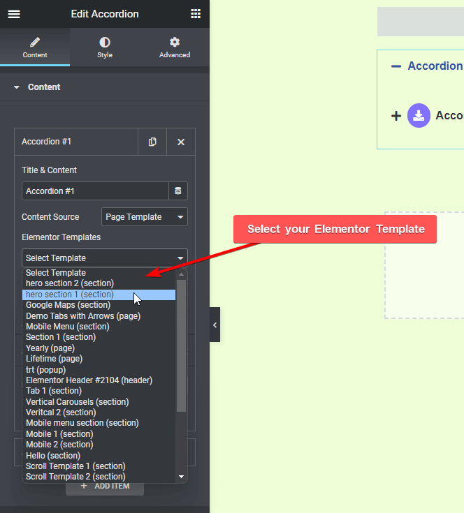
When you select the page template, you get the option to select the template from the dropdown. You only see content if a template has been created from beforehand.
The template method, is truly limitless and gives you power to show any form of content like gallery, carousel, WooCommerce products, blog posts or anything you can imagine creating in Elementor.
Here you will see a backend visibility option, which speeds up the editing experience by not loading the Elementor template content in backend. If you want to see how things look you can turn it on, and then make it off once done.
Next you will see the show icon option, using this you can add an extra icon inside the accordion title element. This is a separate icon than your normal closing and opening icon. This can be unique for every title, where you get to choose your icons from multiple library and customize the colour accordingly.
Lastly you will see a unique ID, which gives anchor ID to an individual accordion content. This is helpful when you want to directly link and show a specific accordion tab content. You can read more about this process from here.
You can add as many Accordion contents by clicking on the ‘Add Item’ button.
How to Change Accordion Icon?
In order to change the standard icons of all the accordion items go to the Icon Option, make sure the Show Icon toggle is on, from there you can set the open and close icons for the accordion items.
Understanding Special Options
These special options make this Accordion widget truly powerful, we have covered a dedicated doc on each one of them so that you can understand them in depth.
- Active Accordion
- On Hover Accordion
- Horizontal Accordion
- Expand/Collapse Content Button
- Scroll Top
- Stagger Animation
- Search
- Slider/Pagination
- Autoplay
- SEO Scheme Markup
- Carousel Connection ID
How to Style your Accordion Content?
Under the style tab you will see some options to style your accordion.
Icon tab (Free) – From here you can control the styling of the standard accordion icons, like alignment, colour, size, and gap.
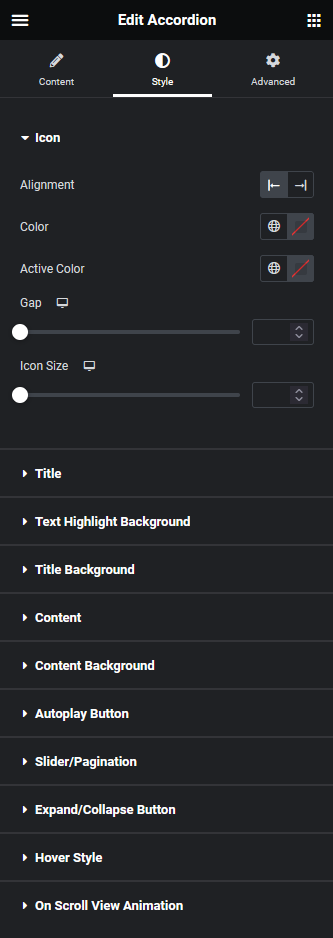
Title – From here you can style the title of the accordion. You can customize the title typography, and colour.
You can also style the additional icon of the title from here, you can control the icon size, icon background, box shadow etc.
Title Highlight Background – From here, you can manage the searched text typography, colour and background colour for both normal and hover states to highlight the text.
Title Background – From here you can control the overall title background styling of the accordion element. You can add inner padding to the title, and change the background colour.
Use the Box Border option to add a border around the title, you can also control the border styling from here.
You can manage the spacing between the accordion items from here too.
Content – From here you can control the typography of the content inside the accordion.
Content Background – From here you can change the background of the description area of the accordion. You can control the content area margin, padding and background colour.
You can also add a border to the accordion content area using the Box Border option.
Autoplay Button – You’ll see this option when the Autoplay option is enabled in the content tab. From here, you can manage the autoplay button style.
Slider/Pagination – You’ll see this option when the Slider/Pagination option is enabled in the content tab. From here, you can manage the slider or pagination navigation style.
Expand/Collapse Button – You’ll see this option when the Expand/Collapse Content Button option is enabled in the content tab. From here, you can manage the expand or collapse button style.
Hover Style – You get 2 unique hover styles to the accordion title from this section, as you can see in the GIF below.

On Scroll View Animation – This is our global extension available for all our widget, this adds scrolling animation as the widget comes in viewport.
Learn more about On Scroll View Animation
Advanced options remain common for all our widget, you can explore all it options from here.
