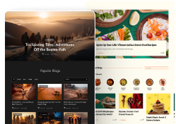
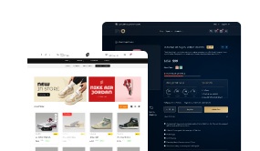
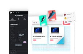
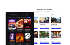
Providing additional information in the header can improve the user experience, especially for large websites or e-commerce websites. With the Header Meta Content widget from The Plus Addons for Elementor, you can add multiple types of meta content in the header.
You can easily add a search, mini cart, call to action button, language switcher, extra toggle button etc. in the header.
Required Setup
- Elementor FREE Plugin installed & activated.
- You need to have The Plus Addons for Elementor plugin installed and activated.
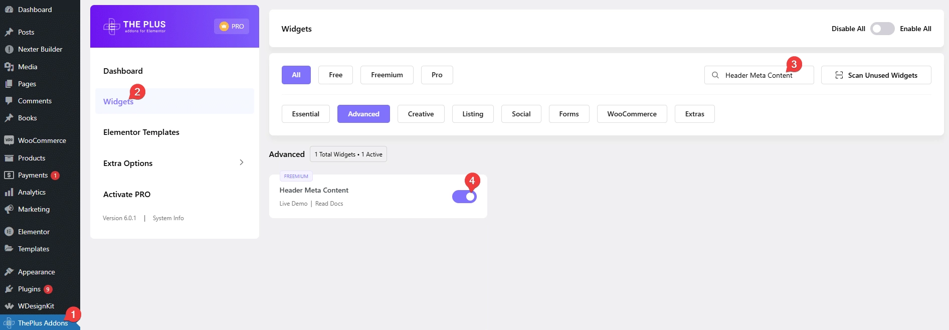
- Make sure the Header Meta Content widget is activated, to verify this visit The Plus Addons → Widgets → and Search for Header Meta Content and activate.
- This is a Freemium widget, to unlock the extra features, you need the PRO version of The Plus Addons for Elementor.
How to Activate the Header Meta Content Widget?
Go to
- The Plus Addons → Widgets
- Search the widget name and turn on the toggle.
Key Features
- Search Bar – You can easily add a search in the header.
- Mini Cart – You can easily add a WooCommerce mini cart in the header.
- Extra Toggle (Pro) – You can easily add an extra toggle menu button in the header.
- Language Switcher (Pro) – You can easily add a language switcher using WPML or Translatepress.
- Music (Pro) – You can easily add a music button in the header to play music.
- Call to Action (Pro) – You easily add multiple call to action buttons in the header.
How to Use Header Meta Content Widget in Elementor?
To use the Header Meta Content widget, add the widget to the header template.
To create the header template, you can use the free Nexter Builder or you can use Elementor Pro if you are already using it.
In the Meta Content tab, you’ll find an item click to open it. In the Select Options dropdown, you’ll find seven options –
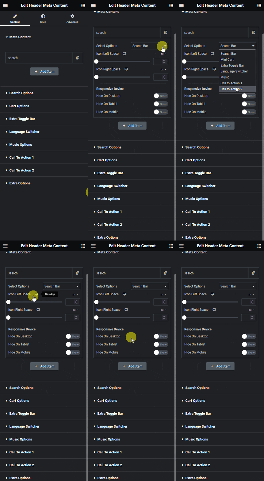
Search Bar – To add a search bar in the header.
Mini Cart – To add a WooCommerce mini cart in the header.
Extra Toggle – To add a menu toggle button in the header.
Language Switcher – To add a language switcher using WPML or Translatepress.
Music – To add a music button in the header.
Call to Action 1 – To add a call to action button in the header.
Call to Action 2 – To add a second call to action button in the header.
Select the appropriate option.
Then, from the Icon Left Space and Icon Right Space sections, you can adjust the icon spacing from left and right, respectively.
From the Responsive Device section, you can manage the visibility of the item for different devices.
Note: To make the selected option visible in the front end, you’ll have to enable the display toggle from the corresponding tab below. For instance, if you select Search Bar, then you have to enable the display toggle from the Search Options tab.
You can click on the +Add Item button to add multiple items.
From the Extra Options tab, you can align the items and manage icon padding.
How to Style the Header Meta Content Widget?
Under the Style tab, you’ll find all the styling options of the Header Meta Content widget.
Search Bar Style – You’ll see this option only when you enable the display toggle in the Search Options tab. From here, you can manage the style of the search bar.
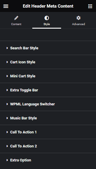
Cart Icon Style – You’ll see this option only when you enable the display toggle in the Mini Cart tab. From here, you can manage the style of the mini cart icon and mini cart container background.
Mini Cart Style – You’ll see this option only when you enable the display toggle in the Mini Cart tab. From here, you can manage the mini cart content style.
Extra Toggle Bar – You’ll see this option only when you enable the display toggle in the Extra Toggle Bar tab. From here, you can manage the style of the extra toggle bar.
WPML Language Switcher – You’ll see this option only when you enable the display toggle in the Language Switcher tab and select WPML. From here, you can manage the style of the WPML language switcher.
Translatepress Language Switcher – You’ll see this option only when you enable the display toggle in the Language Switcher tab and select Translatepress. From here, you can manage the style of the Translatepress language switcher.
Music Bar Style – You’ll see this option only when you enable the display toggle in the Music Options tab. From here, you can manage the style of the music options.
Call To Action 1 – You’ll see this option only when you enable the display toggle in the Call To Action 1 tab. From here, you can manage the style of the call to action 1 button.
Call To Action 2 – You’ll see this option only when you enable the display toggle in the Call To Action 2 tab. From here, you can manage the style of the call to action 2 button.
Extra Option – By enabling Sticky Options toggle, you can manage the normal and hover color of different meta content in sticky header. To use this feature you have to add this widget and the Navigation Menu widget in the same container and use its sticky menu option.
On Scroll View Animation – This is our global extension available for all our widget, this adds scrolling animation as the widget comes in viewport.
Learn more about On Scroll View Animation
Advanced options remain common for all our widget, you can explore all it options from here.
Suggested reading, How to Use Elementor Header Templates [Easy Guide]
