

The Tabs widget is a very useful widget when you want to display a large amount of content in a limited space by splitting the content into multiple tabs.
This gives a better user experience by allowing users to get content in a more organized way.
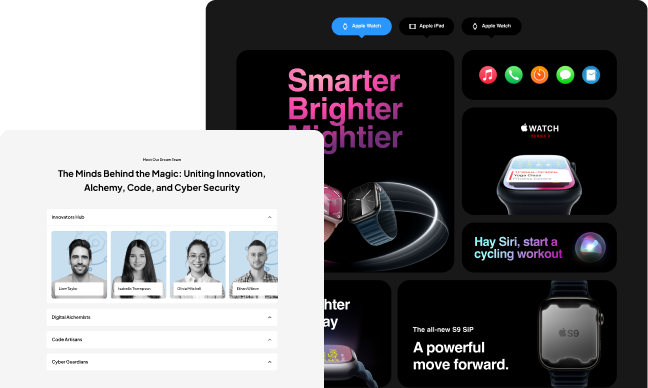
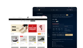
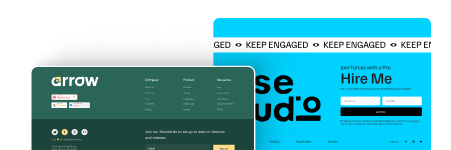
One of the most common uses of tabs can be seen on E-commerce websites, where you will see product details, other specifications, reviews, etc., in various tabs, making it very easy for readers to consume the information.
Check the Live Widget Demo
Required Setup
- Elementor FREE Plugin installed & activated.
- You need to have The Plus Addons for Elementor plugin installed and activated.
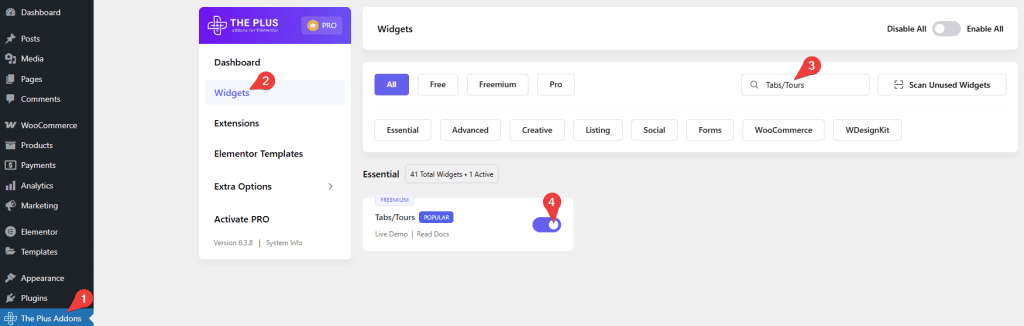
- Make sure the Tabs/Tours widget is activated. To verify this, visit The Plus Addons → Widgets → and search for Tabs/Tours and activate.
- This is a Freemium widget to unlock the extra features; you need the PRO version of The Plus Addons for Elementor.
How to Activate the Tabs/Tours Widget?
Go to
- The Plus Addons → Widgets
- Search the widget name and turn on the toggle.
Key Features
- Multiple content sources – You can add content to your tabs from multiple sources Content (Free) and Page template (Pro). With the content option, you can also use shortcodes to display content in your tabs.
- Add description and hint (Pro) – You can easily add some description and hint to your tab titles.
- Easily add multiple icons to tabs (Free) – You can add different inner and outer icons for the tab titles.
- Unique ID (Pro) – You can add a unique id for each tab item to create anchor links directly to the tab item easily.
- Adjust tab title position (Free) – You can easily adjust the tab title position.
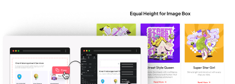
- Multiple layouts for tabs (Free) – There are two layout options for your tabs to choose from Horizontal and Vertical.
- Add swipe or slide effect (Pro) – You can add beautiful swipe or slide effects (horizontal tabs) to your tab titles, so you can easily navigate a long list of tabs.
- Active Tab (Pro) – This option allows you to keep all tabs closed or make any specific tab active by default.
- On Hover Tab (Pro) – Easily open your tabs when someone hovers over the title of the tab.
- Close tab on second click (Pro) – With this option, you can make your tabs close on the second click.
- Add arrow indicator (Pro) – You can add an arrow indicator to your hover and active mode tabs.
- Carousel Connection ID (Pro) – You can make a connection between your tab and the Carousel Anything widget with a unique ID. So when a user clicks on a tab item, the slider will also change.
- Split Tabs in columns (Pro) – Easily split your tab titles into columns.
- Autoplay (Pro)- Make your tabs play automatically from one item to another.
How to Add Content in Elementor Tabs/Tours Widget?
To add content in The Plus Addons for Elementor Tabs/Tours widget, drag and drop the widget on the page and go to the tab you want to add the content to.
Layout
From the Layout section, you have to select the content layout for your tabs. Here you’ll find two options:
- Horizontal – To display the tab layout horizontally, with tab titles placed side by side.
- Vertical – To display the tab layout vertically, with tab titles stacked one below the other.
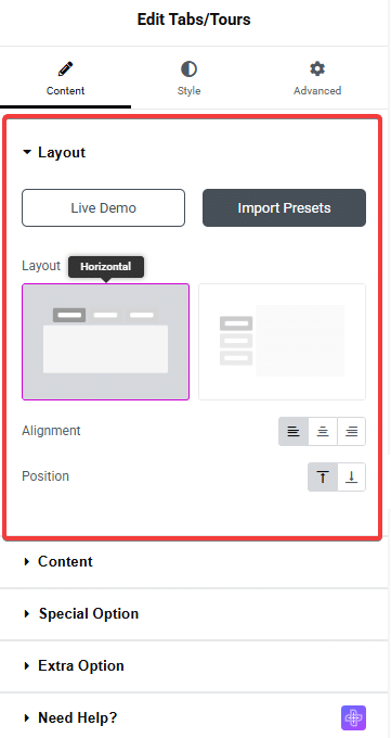
In the Alignment field, you can set the alignment of the tab’s title to Left, Center, or Right, based on your selected tab layout.
In the Position field, you can choose the position of the tab’s title: Top or Bottom for horizontal layout, and Left or Right for vertical layout.
Content
In the Title field, you can add the title for the tab.
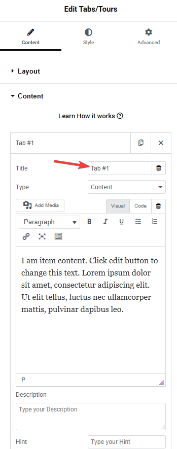
For the content, you can choose two sources: Content (Free) and Page Template (Pro).
With the content option, you can directly write the content in the editor or use shortcodes to display the content.
Now, with the Page template option, you can create truly unique layouts for your tab content using the Elementor page builder. In this option, you have to choose a previously created Elementor template from the dropdown list.
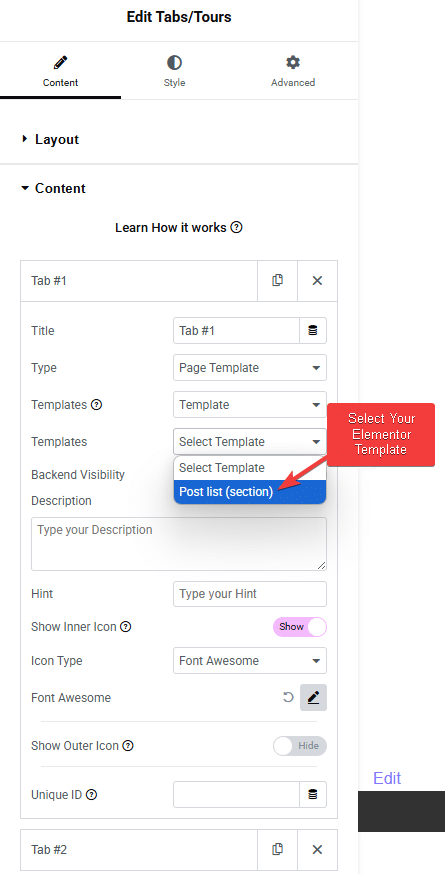
By using the template method, you get to utilize the power of Elementor page builder within your tab content. This way, you can show almost any type of content, like images, galleries, videos, blog posts, carousels, WooCommerce products, etc.
Or you can choose Shortcode from the Templates dropdown to use Elementor template shortcodes as well.
When you select an Elementor template, you will see a Backend Visibility toggle. By default, it is turned off to provide a smooth editing experience, but you can turn it on to see your template in the backend. Once done, you can turn it off.
Then there are options to add a Description (Pro) and Hint (Pro) to the tab title.
Enabling the Show Inner Icon toggle allows you to add an inner icon to the tab layout.
From the Icon Type dropdown, you can select different types of inner icons to add to the tab. Here you’ll find four options –
- Font Awesome – To use icons from the original Font Awesome library,
- Font Awesome 5 – To use icons from Font Awesome version 5,
- Icons Mind – To use icons from the Icons Mind collection,
- Image – To use a custom image as the icon
Based on your selection, you have to add an icon.
Enabling the Show Outer Icon toggle allows you to add an outer icon to the tab layout.
You can use the same options as those available for the Show inner icon.
You can easily add multiple icons to the tab title. You can learn more about the process here.
A Unique ID can be used to link to a tab item when you want to send a user directly to a particular tab content. This is most useful for vertical tab content. Learn more about the process here.
Lastly, from the + Add Item button, you can add more tabs.
Special Option
These options of The Plus Addons for Elementor Tabs/Tours widget will make your tabs very unique.
- On Hover Tab – Open tabs on hover.
- Second Click Closed – Close the tab when someone clicks on the tab title for the second time.
- Arrow – You can add an additional arrow icon for the tab titles on hover, as well as to mark the active tab.
- Autoplay
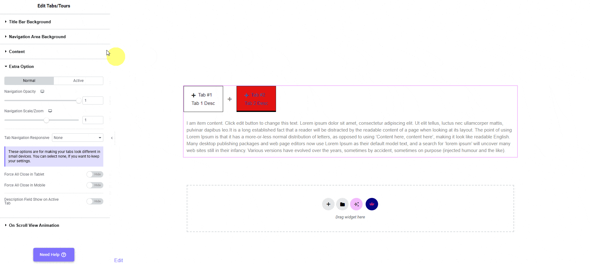
Extra Option
There are some extra options to make your tabs even more powerful. We have covered a dedicated doc on each one of them so that you can understand them in depth.
- Active Tab – Set a specific tab as an active tab or keep all closed by default.
- Swiper Effect – For a long list of tabs, you can add a swipe or slide effect to the tab title for easy navigation.
- Tab Columns
How to Style Elementor Tabs/Tours Widget in WordPress?
To style The Plus Addons for Elementor Tabs/Tours widget, you will find all the styling options under the Style tab.
Inner Icon – From this tab, you can control the outer icon styling, such as size, colour, active colour, and spacing. You can also make your icons full-width from here so they can sit on top of the tab title.
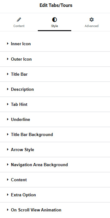
Outer Icon (Pro) – You can control the size, colour, active colour, and mobile visibility of the outer icon from this tab.
Title Bar (Free) – From this tab, you can control your tab’s title, like its typography, colour, nav alignment, nav width, etc. You can also make all your titles the same width or hide them altogether.
Description (Pro) – If you are using a description for your tab titles, you can style them from here. Control their typography, colour, width, margin, and you can use word break to maintain the design as well.
Tab Hint (Pro) – For your tab hint styling, use this tab and manage its position, typography, colour, background colour, border, etc.
Underline (Pro) – You can add beautiful underline borders to your tab title and style it from here.
Title Bar Background (Free) – From this tab, you can control everything style-related to the individual tab title background, such as nav inner padding, margin, gap between nav, background colour, border, box shadow (pro), etc.
Arrow Style (Pro) – To style the additional arrow of your tab title, use this section.
Navigation Area Background (Pro) – From here, you can style the overall background of the navigation area. You will find all the necessary styling options, like background, margin, padding, border, etc., to make a beautiful navigation background.
Content (Free) – This tab is for styling the tab content typography and colour.
Content Background (Free) – In order to style the tab content area background, use this tab and control its padding, margin, background, border, etc.
Extra Option (Freemium) – Under this tab, you find some interesting styling options for your tabs, like zoom and opacity of the tab title for both normal and active states. You will find some additional responsive options for both mobile and tablets.
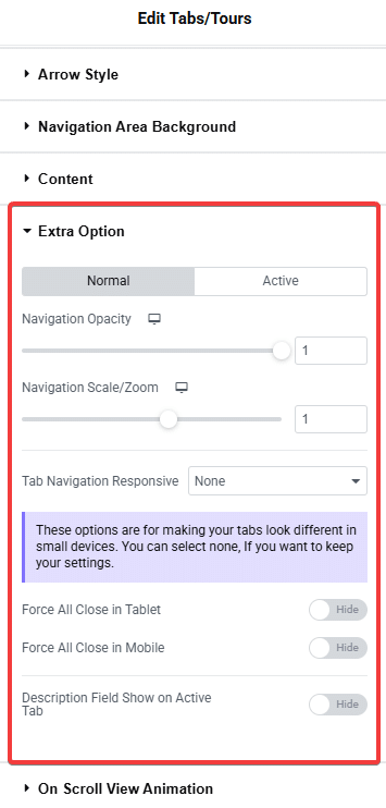
–Tab Navigation Responsive – All the options are for mobile only.
- Full width: If you have a small number of tabs, you can make the tab titles take the full width of the screen.
- One by one: You can align tab titles one after another vertically. You can also control the spacing between the titles from here.
- Force Accordion: With this option, you can turn your tabs into an accordion on mobile. You’ll also find all the styling options for the accordion.
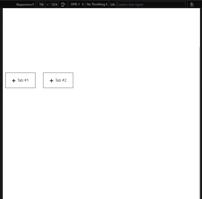
Force All Close in Tablet – This will make all tabs close by default on tablet devices only.
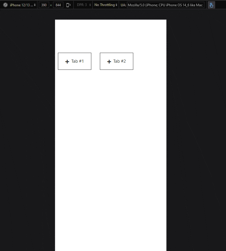
– Force All Close in Mobile – This will make all tabs closed by default on mobile devices.
Description Field Show on Active Tab – If you are using descriptions for your tab title, by default, it will show on all titles, with this option, you can make it visible for the active tab title only.
On Scroll View Animation – This is our global extension available for all our widgets, which adds scrolling animation as the widget comes into the viewport.
Learn more about On Scroll View Animation
Advanced options remain common for all our widgets; you can explore all their options from here.