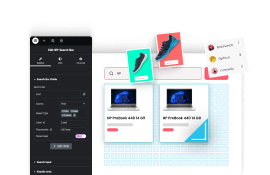
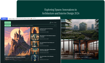
If you want to add image content in your custom layout, you can do that with the Image content type option of the Hover Card widget of The Plus Addons for Elementor. Enhance the visual appeal of your hover cards by adding captivating images, making your website more engaging and visually appealing.
To check the complete feature overview documentation of The Plus Addons for Elementor Hover Card widget, click here.
Requirement – This widget is a part of The Plus Addons for Elementor, make sure its installed & activated to enjoy all its powers.
To use Image content in the Hover Card widget, add the widget on the page and click the +ADD ITEM button to add an item.
Select the appropriate tag in the Open tab.
Note: If you don’t want to wrap the content inside another tag you can set the Open Tag to None.
If you want, you can add a class name in the Enter Class field.
Then select the appropriate tag in the Close tab.
From the Content dropdown, select Image, then from the Image As dropdown, you can use the image normally or as a background.
Note: If you use the image as background, make sure to add some content inside the element to see the background image.
In the Media field, you can add your image.
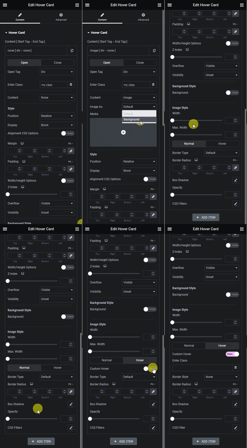
Apart from setting style from Style and Background Style sections, you can manage the image style from the Image Style section. You can set the image width and max width, you can also manage the border, border radius, box-shadow, opacity and CSS filter for both normal and hover state.
You can also use the Custom Hover option to add a hover effect by adding a parent container class name. It works similarly to the Background style custom hover option. Learn the process.
