With the Text content feature in the Hover Card widget of The Plus Addons for Elementor, you can easily add text content within your layout. Enhance your design by adding engaging and informative text to your hover cards, providing a rich user experience on your website.
To check the complete feature overview documentation of The Plus Addons for Elementor Hover Card widget, click here.
Requirement – This widget is a part of The Plus Addons for Elementor, make sure its installed & activated to enjoy all its powers.
To use a Text content in the Hover Card widget, add the widget on the page and click on the +ADD ITEM button to add an item.
Select the appropriate tag in the Open tab.
Note: If you don’t want to wrap the content inside another tag you can set the Open Tag to None.
If you want, you can add a class name in the Enter Class field.
Then select the appropriate tag in the Close tab.
Then from the Content dropdown, select Text, then in the Text field you can add your text content.
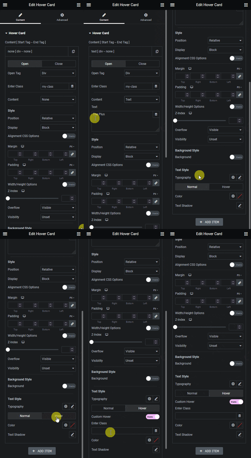
Apart from setting style from Style and Background Style sections, from the Text Style section you can manage text style. You can manage the text typography, you can add the colour and text shadow for normal and hover state.
You can also use the Custom Hover option to add a hover effect by adding a parent container class name. It works similarly to the Background style custom hover option. Learn the process.
Note: When the open tag is set as None, the text style option will not be available.
You can combine different types of content in different items to create a custom layout. Learn the process.
