Column Improvements
Looking for solution of Elementor Column Ordering, Elementor Column advanced width, Elementor Column Custom Media Query Breakpoints, Elementor Custom CSS, and Other Pro Features of Elementor using Plus Extras.
-
Custom Responsive Column Ordering
-
Custom Media Query Breakpoints
-
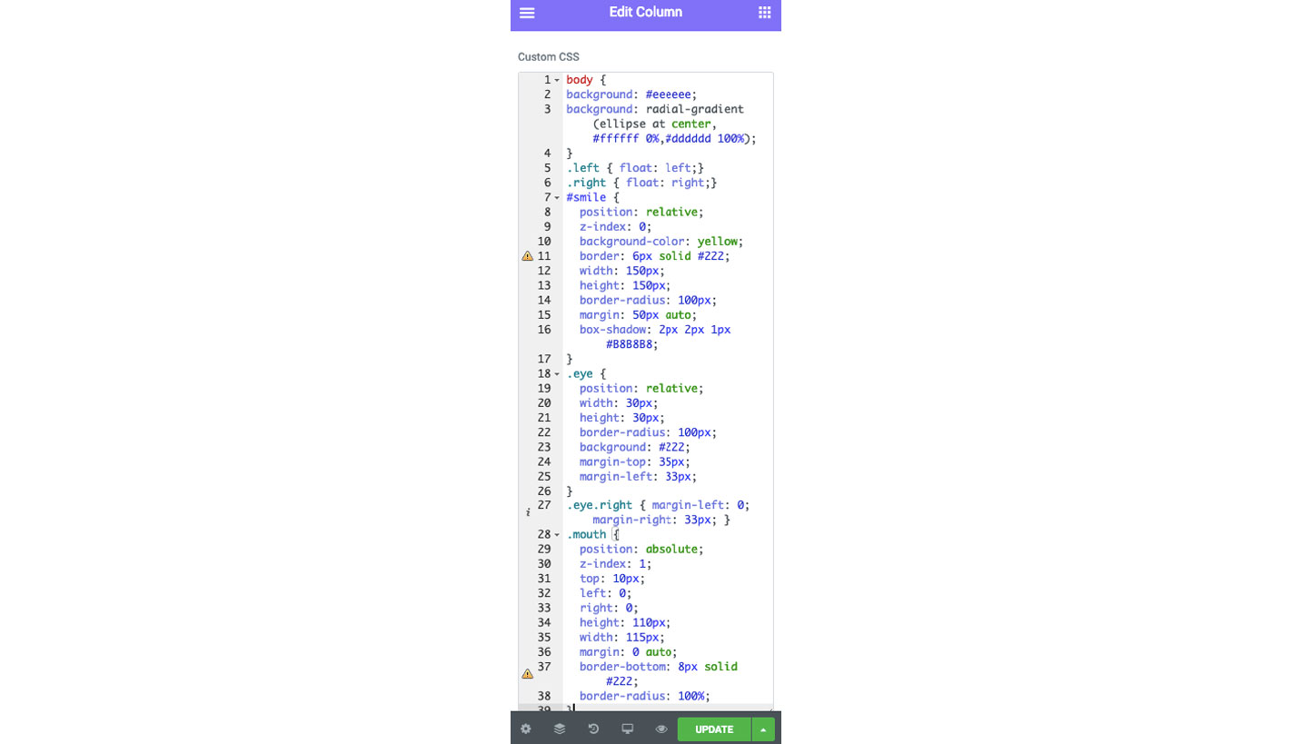
Custom CSS Option
-
Useful Productive Functionalities
Custom Media Query Breakpoints for Column Settings
Setup Column's Width | Margin | Padding | Visibility | Order Sequence for different breakpoints based on @Media Min/Max Width Value(You Can Add Multiple Values too using Repeater.).

Mr. Secure
- This will be hidden from 320px to 850px.
- Sequence of this will be 2nd in 850px to 1200px.

Mr. Chef
- This will be hidden from 1100px to 1200px.
- Sequence of this will be 1st in 850px to 1200px.

Mr. Angry
- Width of this column will be 50% below 650px
- It will have 50px margin on left below 650px
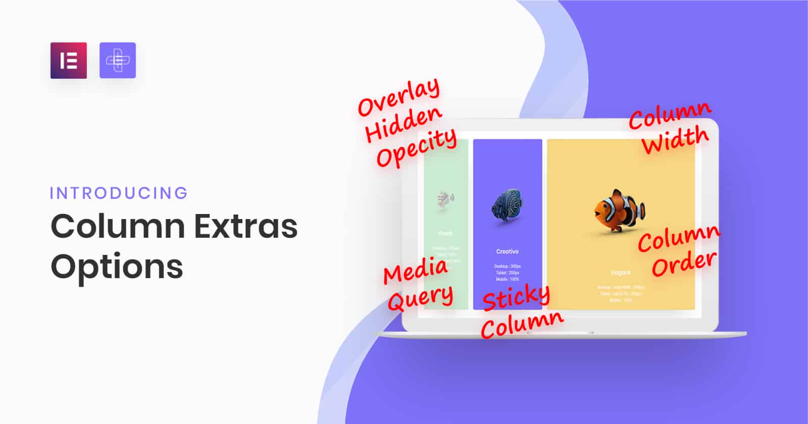
Column Width Options
Use Pixels | Percentage | Calc Function

Fresh
Desktop : 200px
Tablet : 33%
Mobile : calc(100% - 100px)
Creative
Desktop : 300px
Tablet : 200px
Mobile : 100%

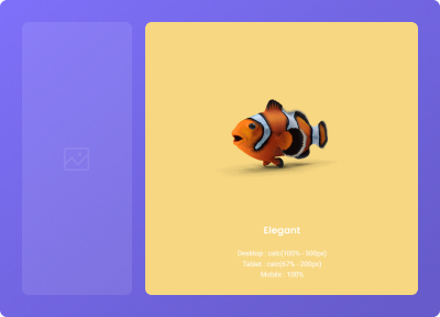
Elegant
Desktop : calc(100% - 500px)
Tablet : calc(67% - 200px)
Mobile : 100%
Responsive Column Order
Now change your column order in different devices. Best for Navigation Menus and Other Creative Layouts.

Love Fins
Desktop : 1st
Tablet : 2nd
Mobile : 3rd

Mr. Jojo
Desktop : 3rd
Tablet : 3rd
Mobile : 2nd

Me Unique
Desktop : 2nd
Tablet : 1st
Mobile : 1st
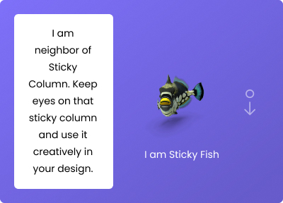
Sticky Column
Make Column Sticky based on height of other columns in row.
I am neighbour of Sticky Column. Keep eyes on that sticky column and use it creatively in your design.

I am Sticky Fish
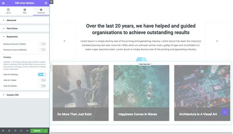
Overlay on Hidden Items in the Backend
No More confusions and To check If one section is hidden in backend. We have marked that with opacity so You can identify that very easily in the backend.
Custom CSS
Add your custom CSS in any Row/Section or Column
