- Starter Templates
- Widgets
- Essentials
- Creative
- Section
- Tabbed
- Form Stylers
- Page Scrolls
- Social
EssentialsCreativeSectionSection Background Tabbed
 Form Stylers
 Page ScrollsFull PageSection BackgroundSocialSocial Reviews & BadgeSocial Feed
- Listing
- Blog Posts
- Woo Products
- Dynamic Content
- Magazine Posts
- Image Gallery
- Testimonials
- Team Members
- Client Logos
Blog PostsPost Loading MethodCustomize Your Entire Blog Website Like a Pro - Introducing Blog Builder
 Woo ProductsWoo Product LayoutsWoo Product Loading Method
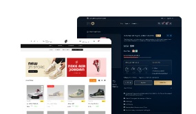
Customize Your Entire WooCommerce Store — Product, Cart, Checkout & Search — With Our WooCommerce Builder
 Dynamic Content
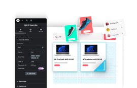
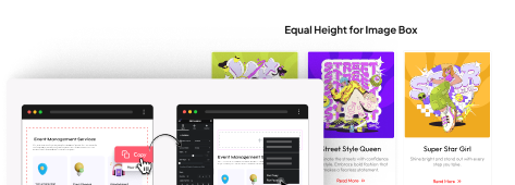
Create Dynamic Website with Live Search, 15+ Ajax Filters & Post Layouts — All With Our Grid Builder

Customize Single, Archive, 404, Header & Footer Pages Visually — All with Our Powerful Theme Builder
 Magazine Posts
-
Magazine Builder
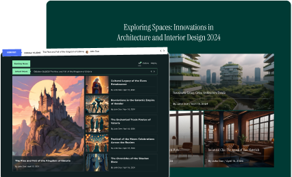
Create Stunning Magazine-Style Layouts with Filters, Sliders & Dynamic Headlines
 Image GalleryLoading Method
-
Visual Showcase
Grab attention with interactive Image Galleries that load fast and look stunning
 Testimonials
-
Build Trust
Build trust instantly by displaying real Testimonials in modern, eye-catching styles
 Team MembersLoading Method
-
Team Profiles
Humanize your brand with engaging Team Member sections that connect with visitors
 Client LogosLoading Method
- Builder
- Header Builder
- Footer Builder
- Blog Builder
- WooCommerce Builder
- Form Builder
- Grid Builder
- Popup Builder
Header Builder-
Header Builder
Footer Builder-
Footer Builder
Build a Custom Footer Using These Powerful Widgets-
The Ultimate Footer Builder
Tired of Theme Limitations? Build the Footer You Actually Want — Logo, Links, Forms, Reviews & More
 Blog Builder
-
Blog Builder
Blog Post LayoutBuild Stunning Blog Layouts with Ease — Fully Customizable Blog Pages with Advanced Widgets
 WooCommerce Builder
-
WooCommerce Builder
Woo Product Listing-
Complete WooCommerce Builder
Create a Modern eCommerce Store with 15+ Ajax Filters & Instant Product Search — No Extra Plugins Needed
 Form Builder
-
Form Builder
-
Form Builder
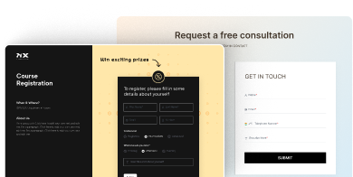
Build Advanced Forms Visually in Elementor — with 22+ Field Types & Ready-to-Import Layouts
 Grid Builder
-
Grid Builder
Post Loop StylesPost Loading MethodAjax Search & FiltersPopup Builder-
Popup Builder
Make Your Popups Smarter with these Widgets-
Advanced Popup Builder
Create High-Converting Popups with Modal, Slide-in, Countdown & More — Fully Customizable in Elementor

- Extras
- Special Features
- Global Options
- Column Extras
- Display Rules
- Effects
- Event Tracker
- Theme Builder
- Extensions
- Figma to Elementor
Special Features-
Elementor But Smarter
Do More in Less Time — Smart Utilities to Supercharge Your Workflow
 Global Options
-
Make it Awe-Some
Mesmerize Your Visitors with Seamless Visual Effects across Your Entire Website
 Column Extras
-
Layout Control
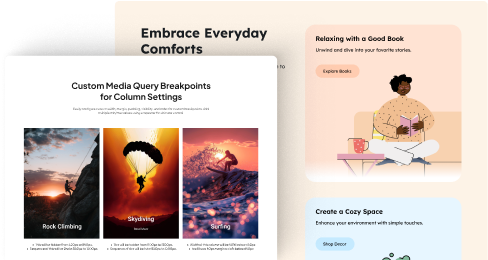
Perfect Your Layout on Every Screen with Custom Column Control, Sticky Positioning & Smart Breakpoints
 Display RulesDisplay ConditionsWooCommerce Display ConditionsCustom Fields Display ConditionsEffects
-
Modern Look
Add a Premium Feel to Your Designs with Modern Effects Like Glassmorphism & Shadows That Pop
 Event TrackerTrack Events Like
-
Measure Everything
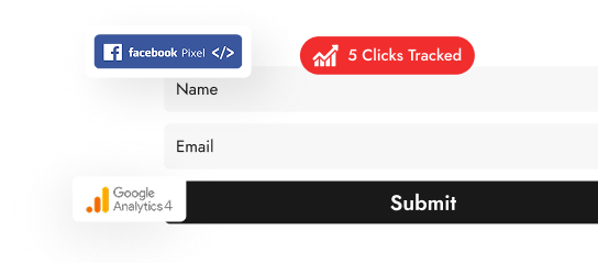
Know What Users Click, Submit & Sign Up For — Track Events Seamlessly with GA4 & Facebook Pixel
 Theme Builder
-
Theme Builder
-
This feature is part of the Nexter Extension — included with The Plus Addons for Elementor Pro plan.
Visually Build Every Part of Your Website with Widgets — Header, Footer, 404, Archive, and More in One Place
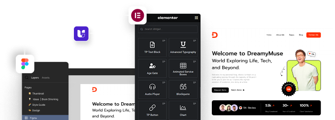
 ExtensionsThis feature is part of the Nexter Extension — included with The Plus Addons for Elementor Pro plan.Figma to ElementorIntroducing UiChemy - Convert your Figma Designs to 100% Editable Elementor Websites
-
Supports Elementor FREE & Pro Widgets
-
Supports The Plus Addons for Elementor Widgets
-
100% Mobile & Tablet Responsive
UiChemy is a standalone Figma plugin — not included in The Plus Addons for Elementor.
- Resources
-
Support
-
Documentations
-
Free Helpdesk
-
Pro Helpdesk
-
Live Chat
-
Al Chat
24X7
-
- Pricing
- Starter Templates
- Widgets
- Essentials
- Creative
- Section
- Tabbed
- Form Stylers
- Page Scrolls
- Social
EssentialsCreativeSectionSection Background Tabbed
 Form Stylers
 Page ScrollsFull PageSection BackgroundSocialSocial Reviews & BadgeSocial Feed
- Listing
- Blog Posts
- Woo Products
- Dynamic Content
- Magazine Posts
- Image Gallery
- Testimonials
- Team Members
- Client Logos
Blog PostsPost Loading MethodCustomize Your Entire Blog Website Like a Pro - Introducing Blog Builder
 Woo ProductsWoo Product LayoutsWoo Product Loading Method
Customize Your Entire WooCommerce Store — Product, Cart, Checkout & Search — With Our WooCommerce Builder
 Dynamic Content
Create Dynamic Website with Live Search, 15+ Ajax Filters & Post Layouts — All With Our Grid Builder

Customize Single, Archive, 404, Header & Footer Pages Visually — All with Our Powerful Theme Builder
 Magazine Posts
-
Magazine Builder
Create Stunning Magazine-Style Layouts with Filters, Sliders & Dynamic Headlines
 Image GalleryLoading Method
-
Visual Showcase
Grab attention with interactive Image Galleries that load fast and look stunning
 Testimonials
-
Build Trust
Build trust instantly by displaying real Testimonials in modern, eye-catching styles
 Team MembersLoading Method
-
Team Profiles
Humanize your brand with engaging Team Member sections that connect with visitors
 Client LogosLoading Method
- Builder
- Header Builder
- Footer Builder
- Blog Builder
- WooCommerce Builder
- Form Builder
- Grid Builder
- Popup Builder
Header Builder-
Header Builder
Footer Builder-
Footer Builder
Build a Custom Footer Using These Powerful Widgets-
The Ultimate Footer Builder
Tired of Theme Limitations? Build the Footer You Actually Want — Logo, Links, Forms, Reviews & More
 Blog Builder
-
Blog Builder
Blog Post LayoutBuild Stunning Blog Layouts with Ease — Fully Customizable Blog Pages with Advanced Widgets
 WooCommerce Builder
-
WooCommerce Builder
Woo Product Listing-
Complete WooCommerce Builder
Create a Modern eCommerce Store with 15+ Ajax Filters & Instant Product Search — No Extra Plugins Needed
 Form Builder
-
Form Builder
-
Form Builder
Build Advanced Forms Visually in Elementor — with 22+ Field Types & Ready-to-Import Layouts
 Grid Builder
-
Grid Builder
Post Loop StylesPost Loading MethodAjax Search & FiltersPopup Builder-
Popup Builder
Make Your Popups Smarter with these Widgets-
Advanced Popup Builder
Create High-Converting Popups with Modal, Slide-in, Countdown & More — Fully Customizable in Elementor

- Extras
- Special Features
- Global Options
- Column Extras
- Display Rules
- Effects
- Event Tracker
- Theme Builder
- Extensions
- Figma to Elementor
Special Features-
Elementor But Smarter
Do More in Less Time — Smart Utilities to Supercharge Your Workflow
 Global Options
-
Make it Awe-Some
Mesmerize Your Visitors with Seamless Visual Effects across Your Entire Website
 Column Extras
-
Layout Control
Perfect Your Layout on Every Screen with Custom Column Control, Sticky Positioning & Smart Breakpoints
 Display RulesDisplay ConditionsWooCommerce Display ConditionsCustom Fields Display ConditionsEffects
-
Modern Look
Add a Premium Feel to Your Designs with Modern Effects Like Glassmorphism & Shadows That Pop
 Event TrackerTrack Events Like
-
Measure Everything
Know What Users Click, Submit & Sign Up For — Track Events Seamlessly with GA4 & Facebook Pixel
 Theme Builder
-
Theme Builder
-
This feature is part of the Nexter Extension — included with The Plus Addons for Elementor Pro plan.
Visually Build Every Part of Your Website with Widgets — Header, Footer, 404, Archive, and More in One Place
 ExtensionsThis feature is part of the Nexter Extension — included with The Plus Addons for Elementor Pro plan.Figma to ElementorIntroducing UiChemy - Convert your Figma Designs to 100% Editable Elementor Websites
-
Supports Elementor FREE & Pro Widgets
-
Supports The Plus Addons for Elementor Widgets
-
100% Mobile & Tablet Responsive
UiChemy is a standalone Figma plugin — not included in The Plus Addons for Elementor.
- Resources
-
Support
-
Documentations
-
Free Helpdesk
-
Pro Helpdesk
-
Live Chat
-
Al Chat
24X7
-
- Pricing
